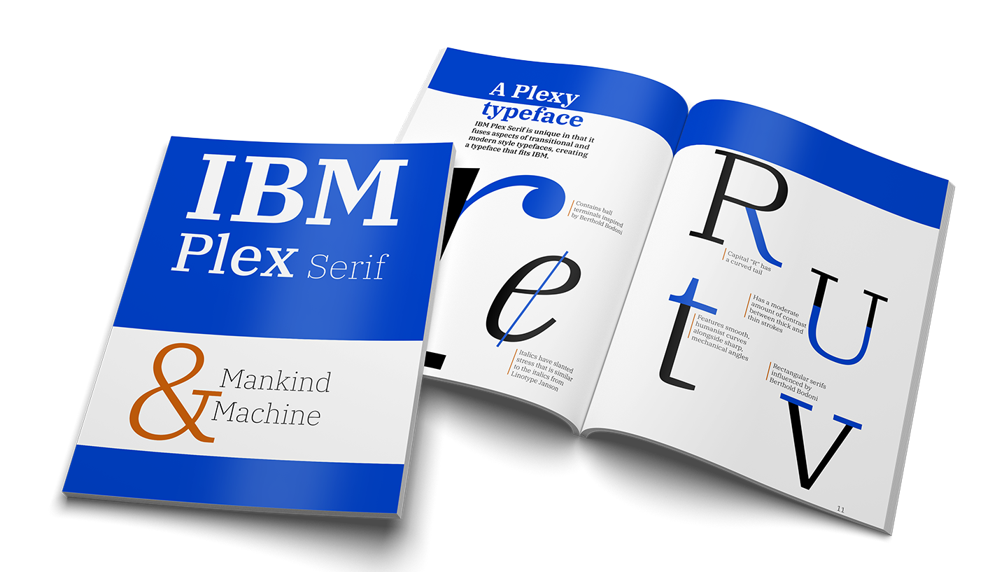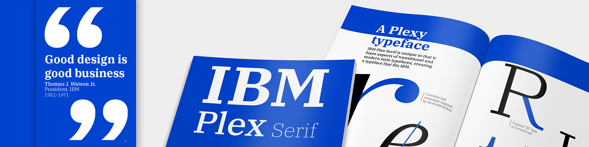
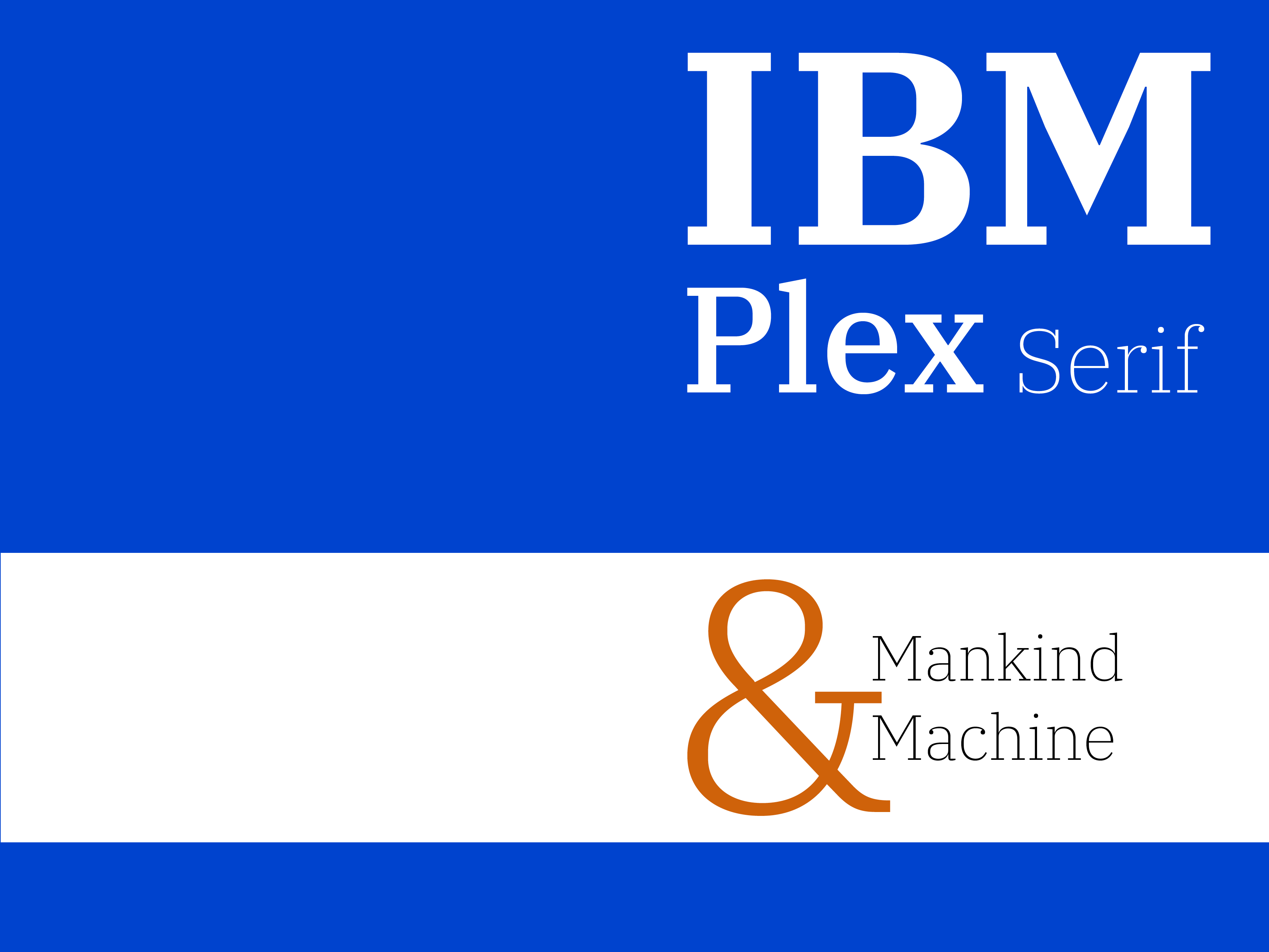
After learning about the IBM Plex Typeface family, I chose to make a type specimen for the serif variation because I was intrigued by how it took influence from older typographic styles while still feeling contemporary enough to represent a modern technology company like IBM.
Skip to final designsProcess
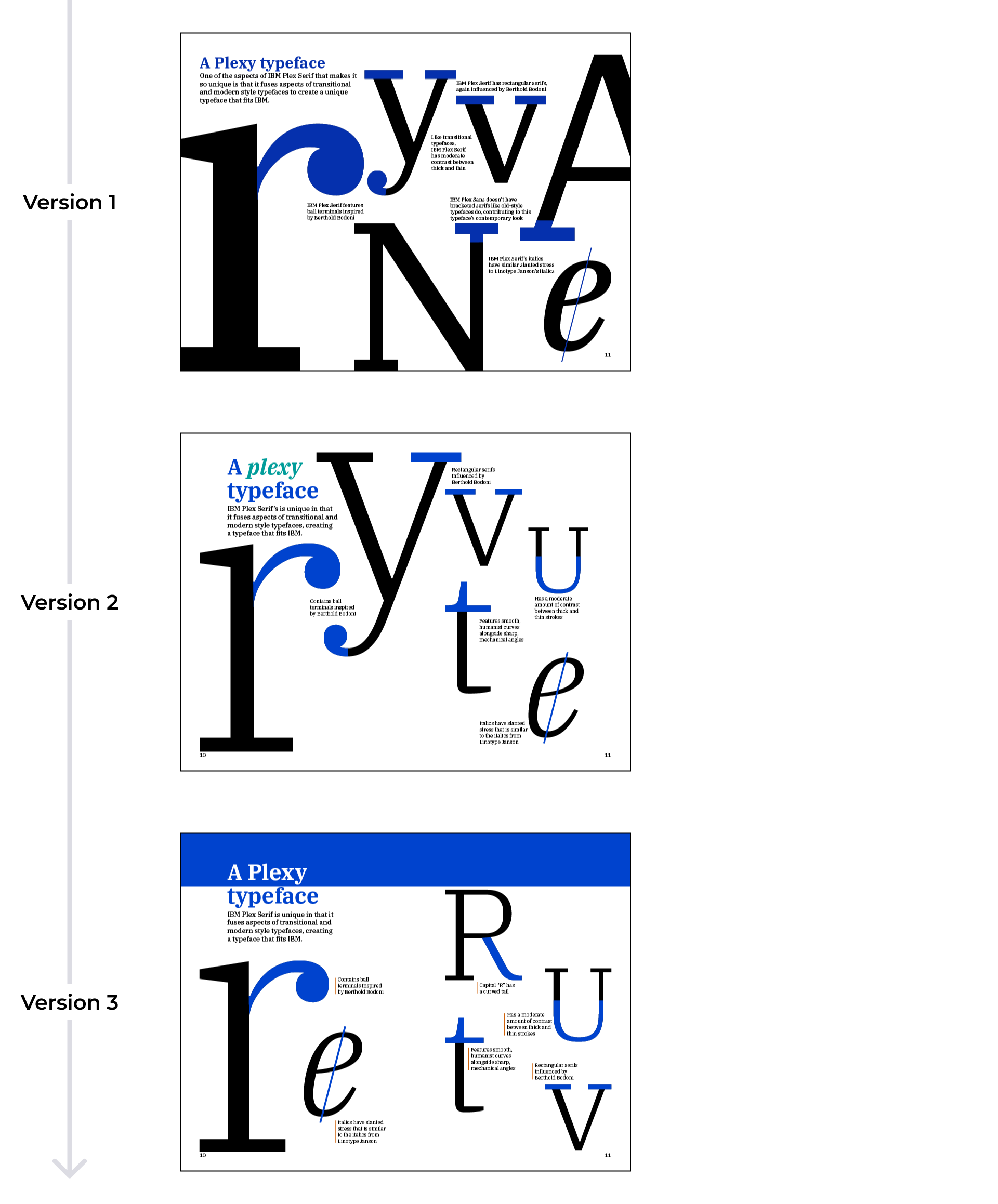
"It's boring"
After I designed my first draft, my professor said that it was boring. After hearing this alongside the critique from my classmates, I redesigned my type specimen to better reflect how interesting IBM and its typeface actually are.
Page from initial draft
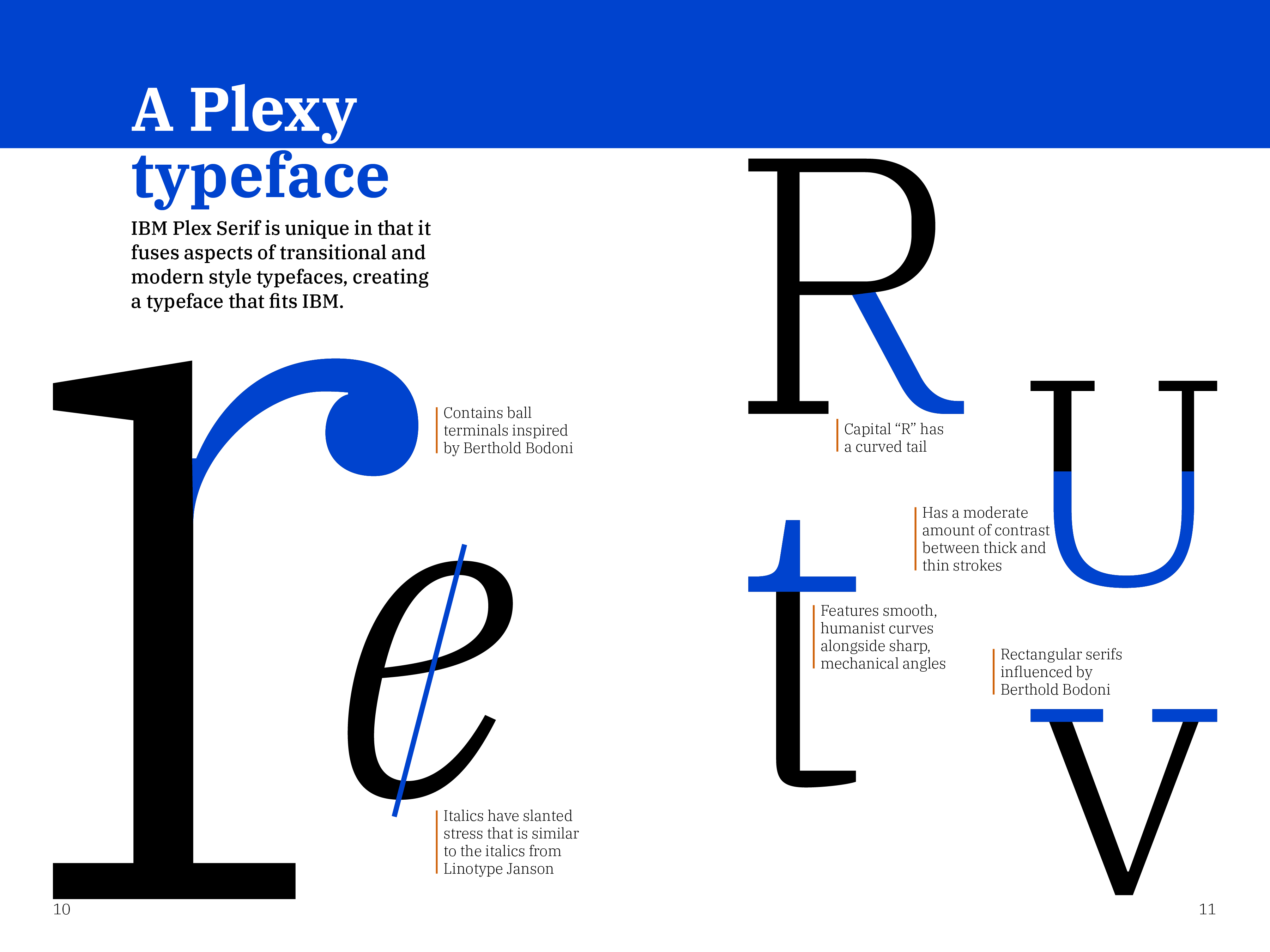
Mankind and machine
One thing that helped me improve my design was to focus on a key message. IBM describes the IBM Plex family as reflecting the company's mission of connecting “mankind and machine.” I noticed specific features of the typeface that reflected that value, so I leaned into that with my design.
To guide my iterations, I focused on showing how IBM Plex Serif demonstrates both human and mechanical qualities. On the spread shown here, I showcased the human and mechanical features of the glyphs. Over the course of my iterations of this spread, I realized that what it needed was more whitespace due to the combination of large letters and smaller descriptions. The more whitespace I added, the less cluttered the spread became.
Iterations
Final designs
Spread 1
Spread 2
Spread 3
Spread 4
Spread 5
Spread 6
Spread 7
Lessons learned
Balancing consistency with surprise
Every page I designed needed to fit together as a cohesive whole, from the layout to the typography. At the same time, I also learned how to add moments that deviate from this uniformity to create interest.
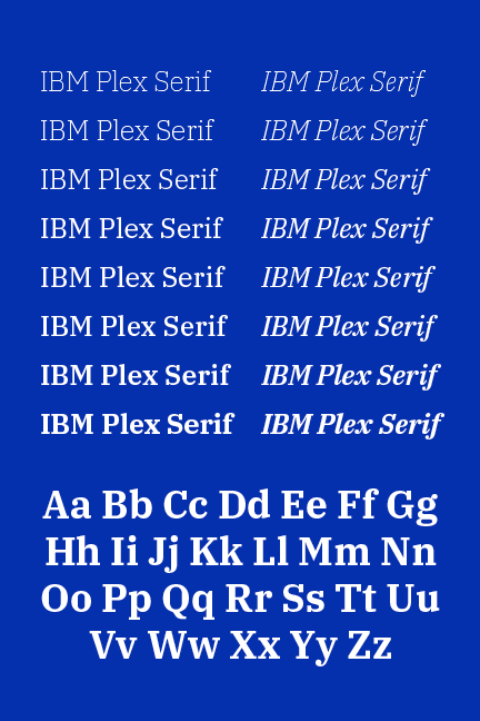
The importance of good typography
Since this was a type specimen, it was vital that I presented the typeface in the best way possible. This helped me hone my typography skills, as I had to pay close attention to kerning, leading, line-length, and typographic contrast.