I wanted to design a brand for a protein shake because they are often overlooked as healthy alternatives for people in a rush. My target audience for this brand is busy young professionals.
Skip to final designsMarks
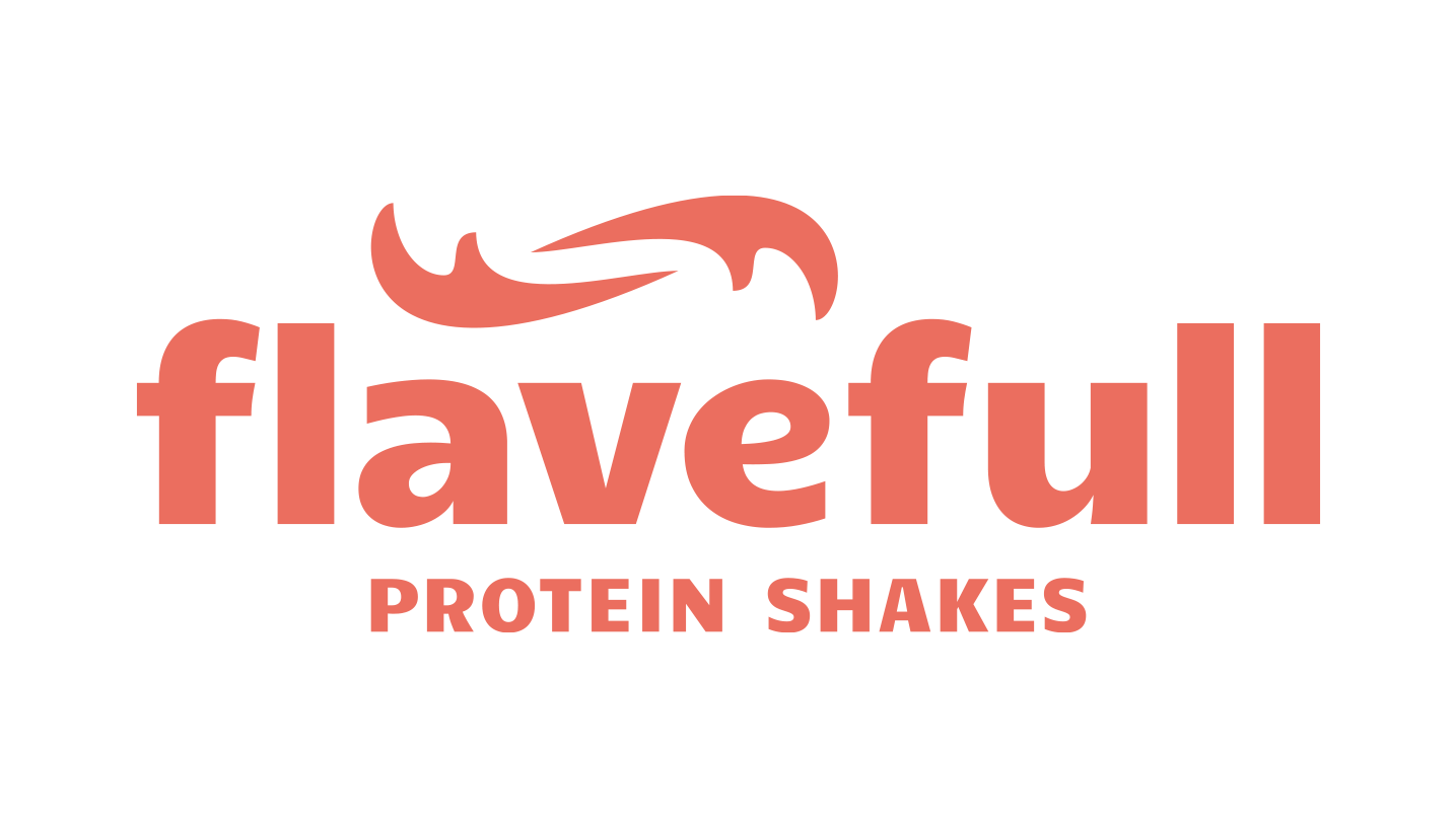
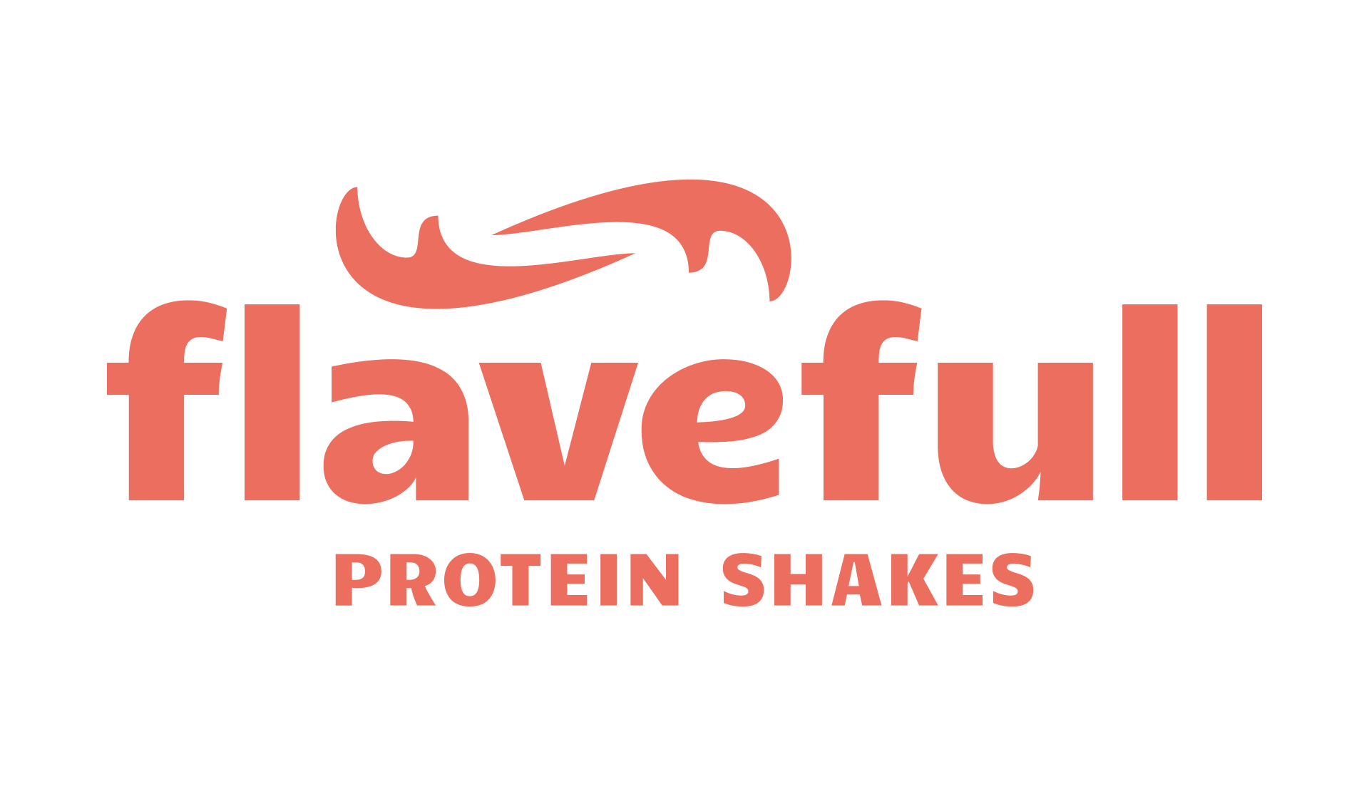
The logo and wordmark
I chose to make the logo two F's (referencing the name "Flavefull") that are in a swirl formation. This gives the logo a sense of movement, which speaks to the energetic nature of the brand.
For the typography, I went with a typeface that has a playful personality, which can be seen here by the contrast between the thick and thin strokes even while the font is set in bold.
Final designs
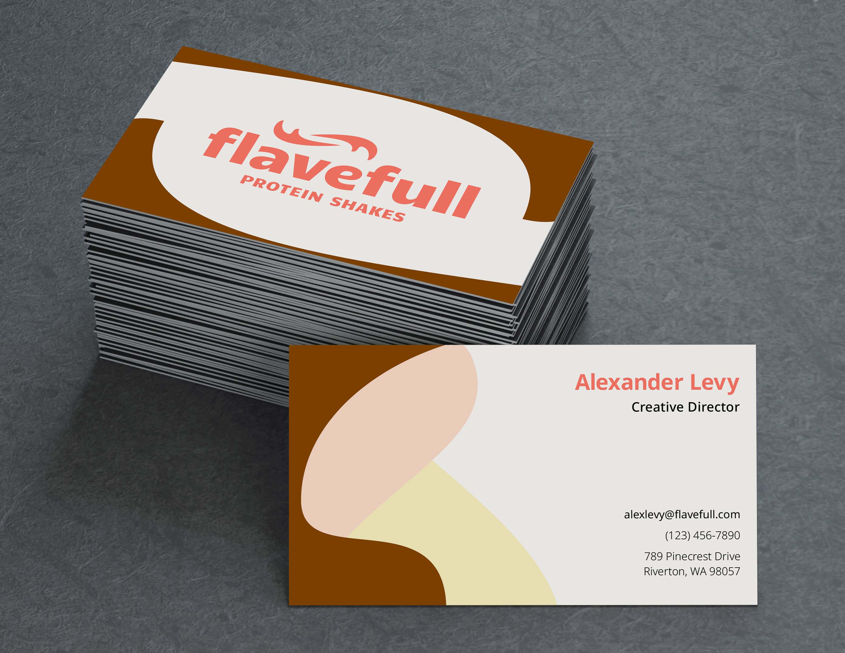
Business card
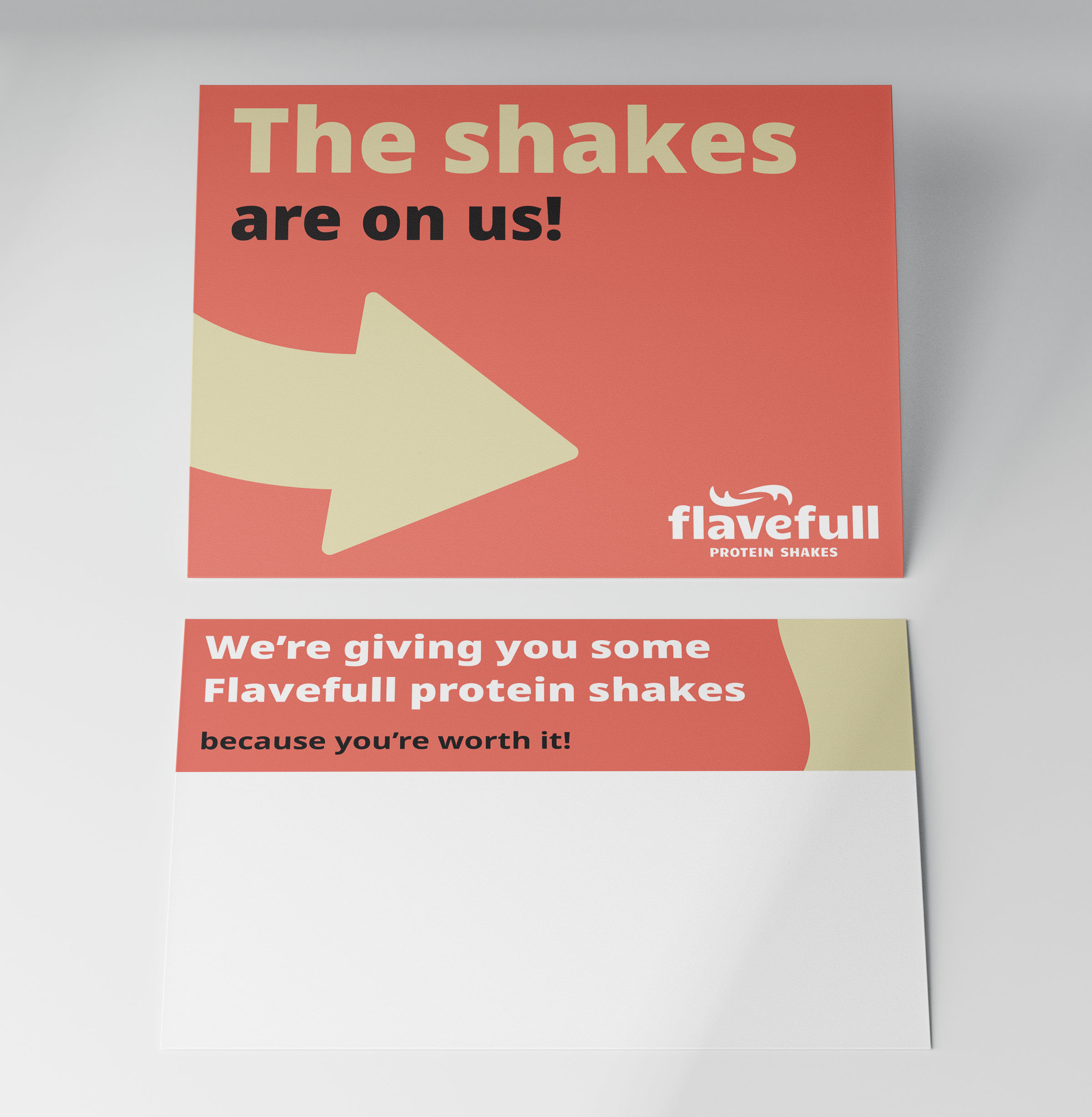
Greeting card
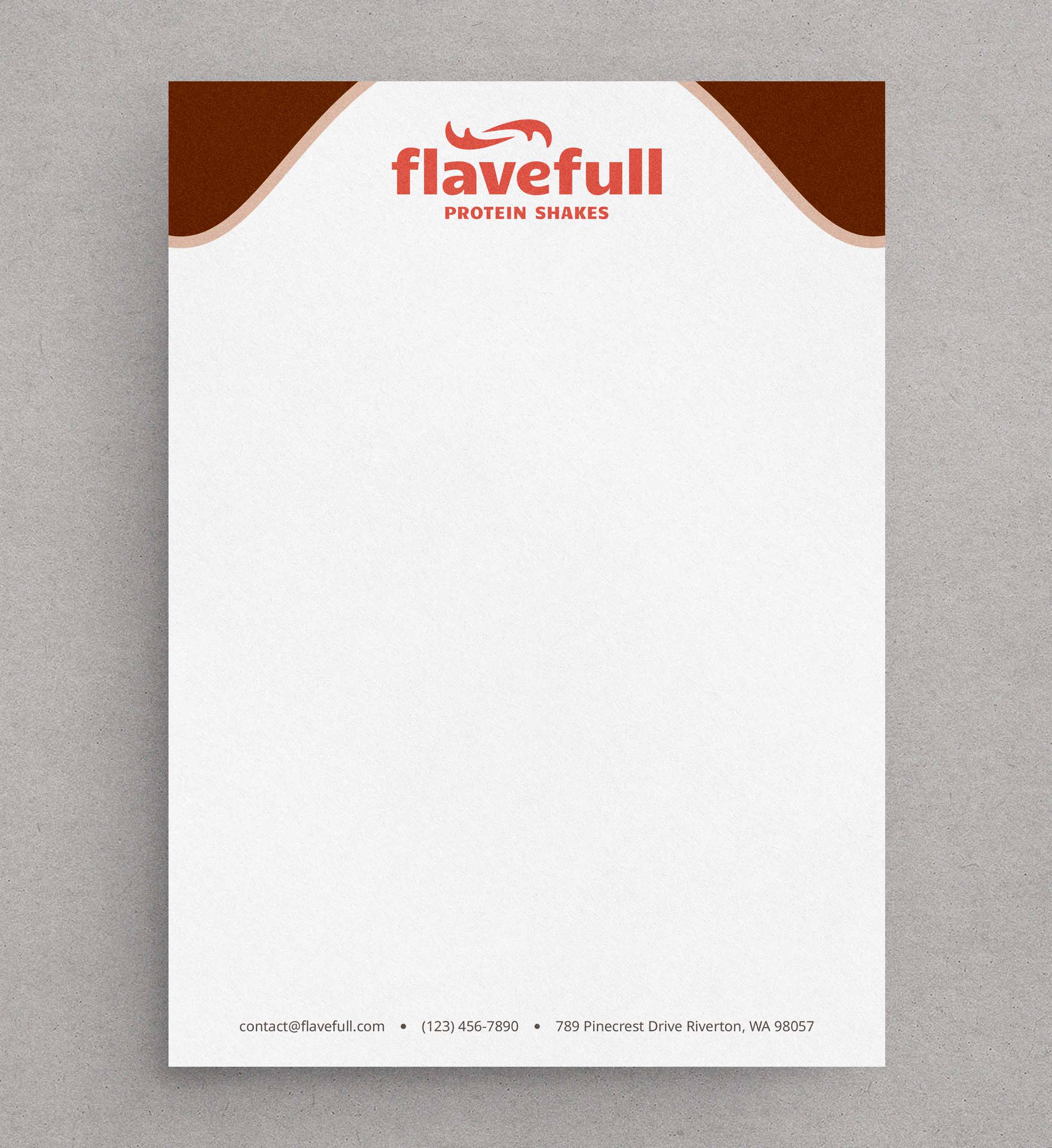
Letterhead
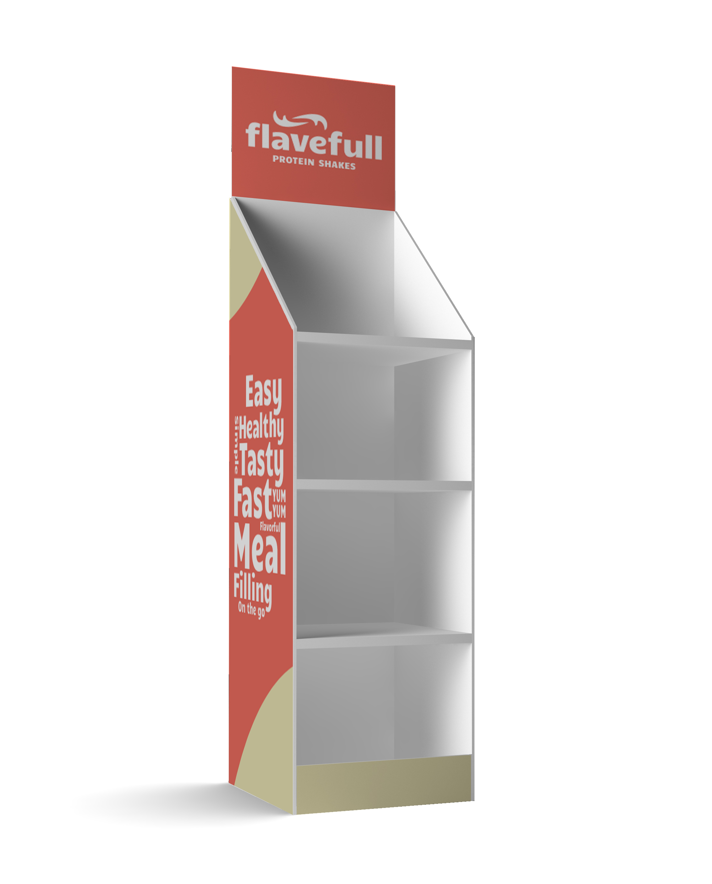
Store display
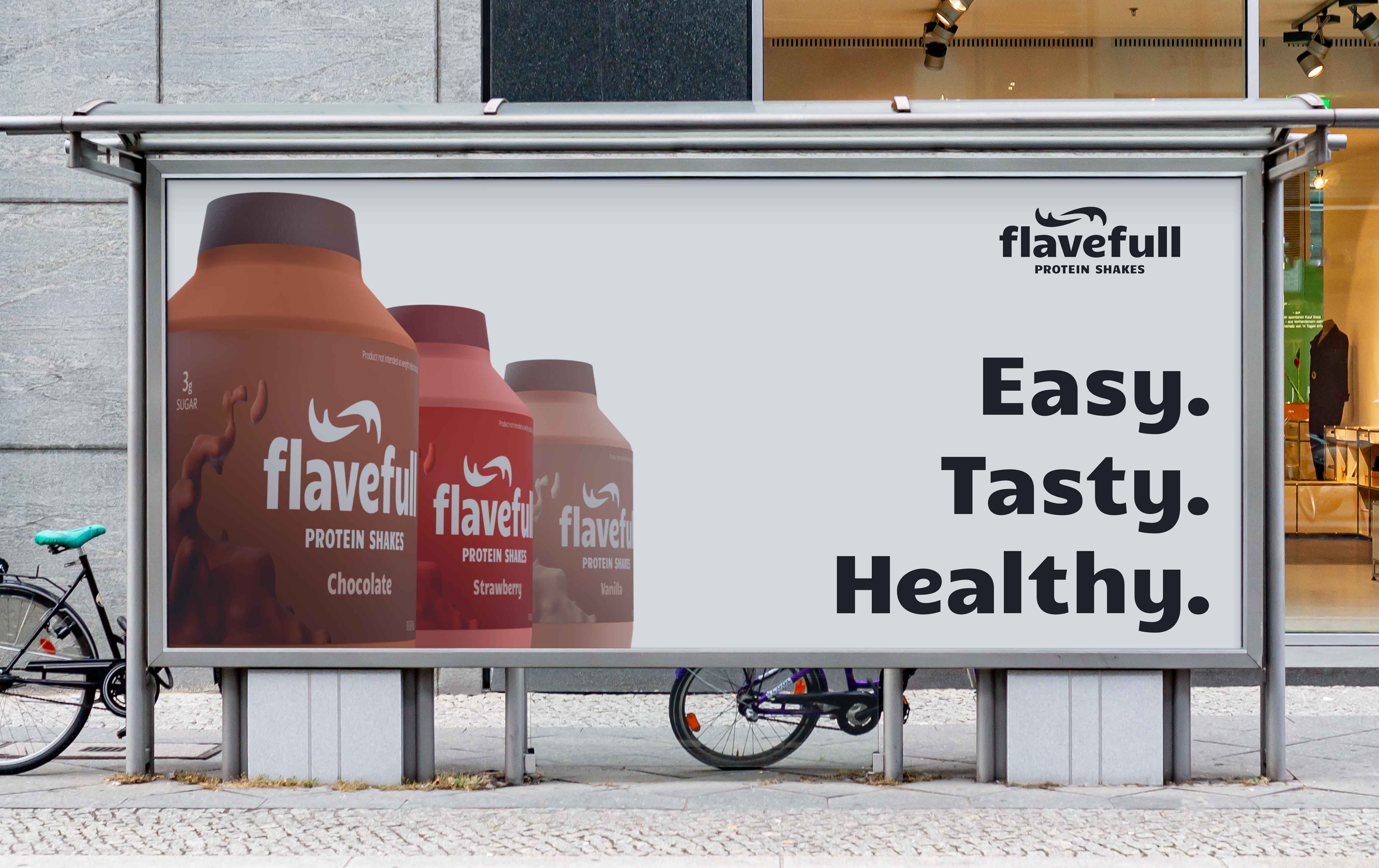
Advertisement
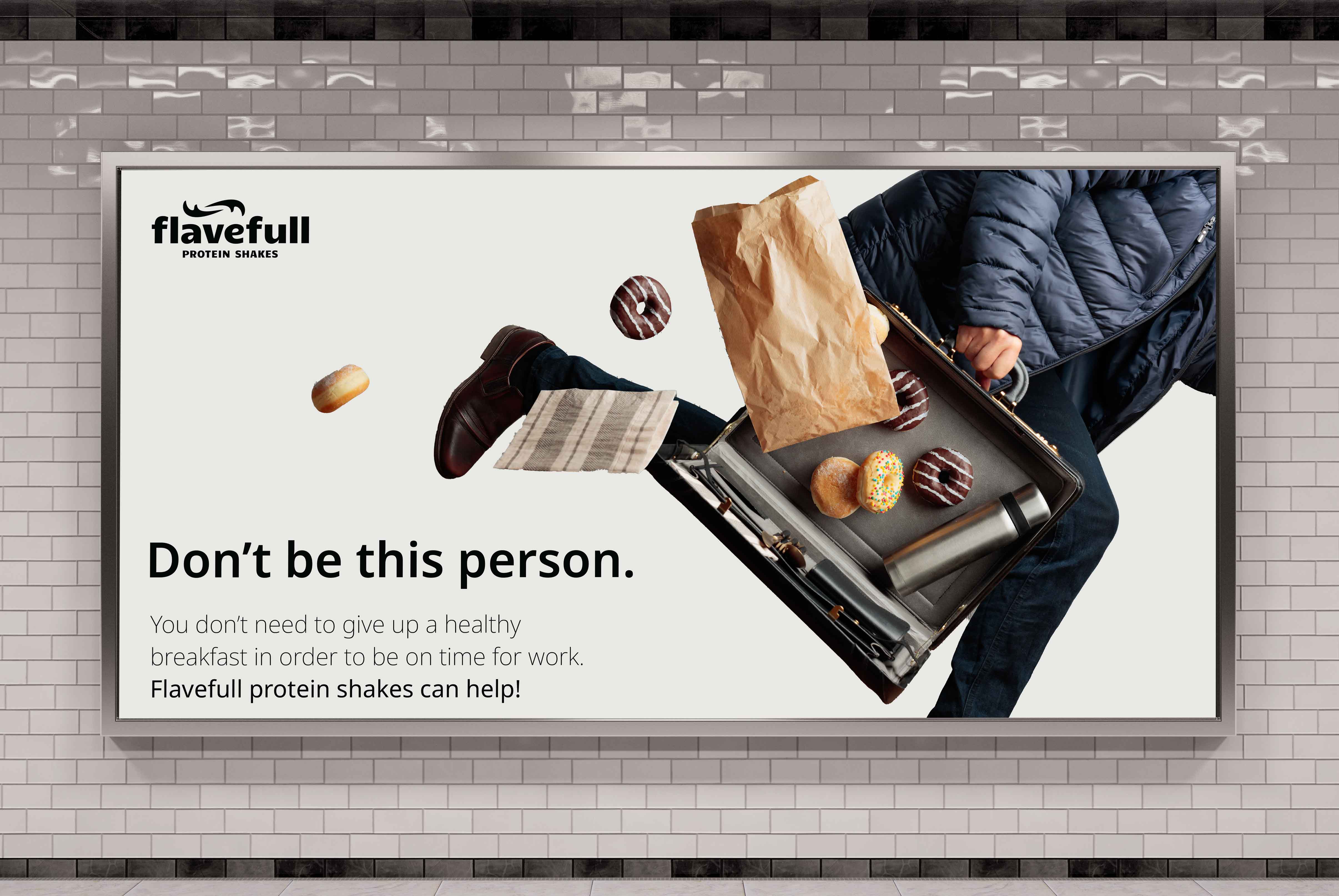
Advertisement
Lessons learned
Integrating 3D into my workflow
To make the bottle mockups, I used 3D software called Blender to make the splashes on the label, as well as to mock up the bottles.
Defining a brand voice
I experimented with different ways I could express the fun, bold, and playful voice that I wanted this brand to have.

