The Newshouse is a news website at Syracuse University intended to give student journalists experience writing for a real news publication and reporting on events across campus.
The director of the website wanted a redesign that gives student journalists more flexibility to change the layout based on editorial decisions, while also overhauling the overall design to be cleaner, more modern, and realistic to implement on the front end and the back end.
Research
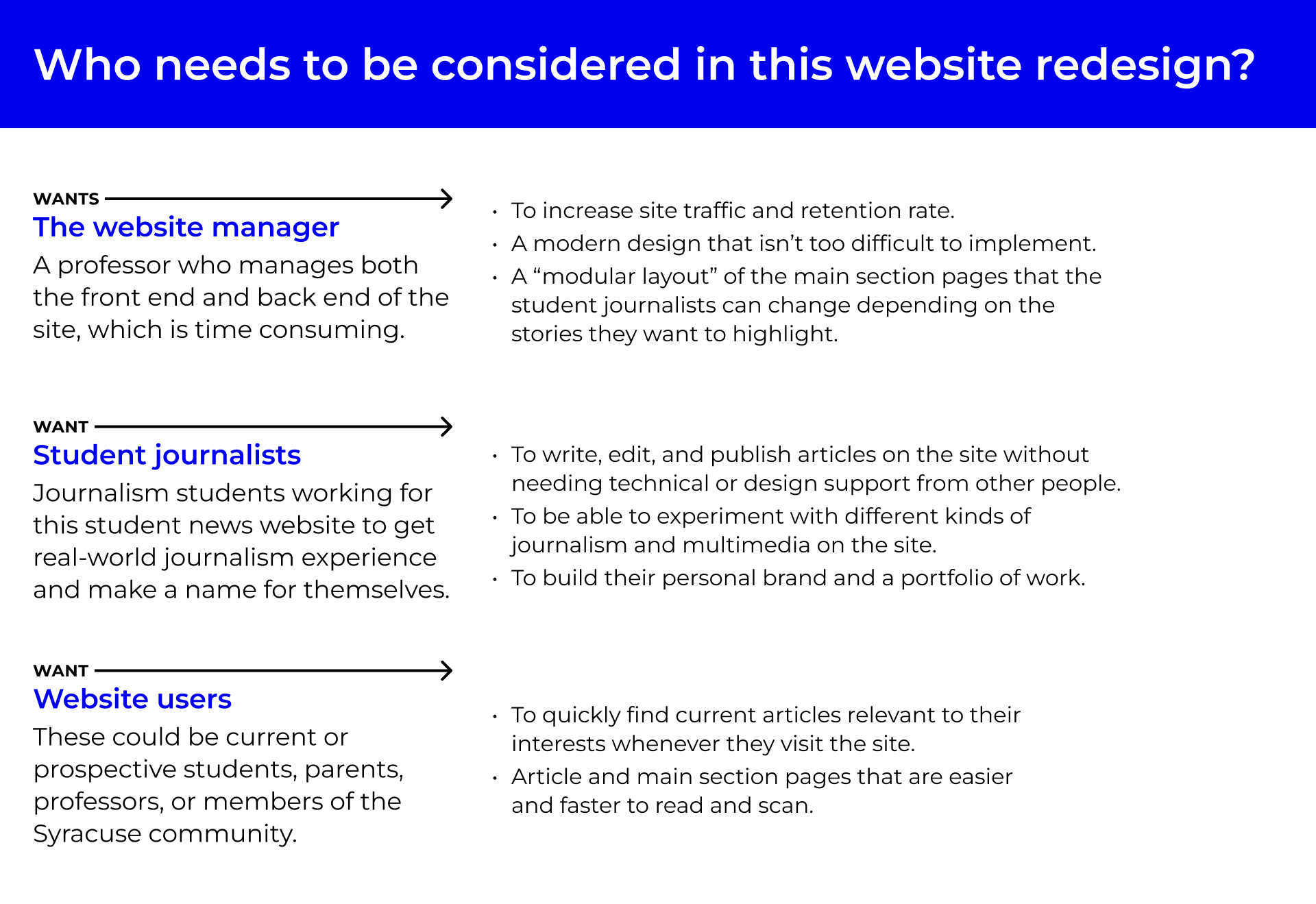
Who am I designing for?
I spoke with some of the key groups of people that use the Newshouse website to find out what problems they have and what changes they want.
Potential design opportunities
After I observed student journalists go through the process of creating and uploading an article to the website, a few things stood out to me.
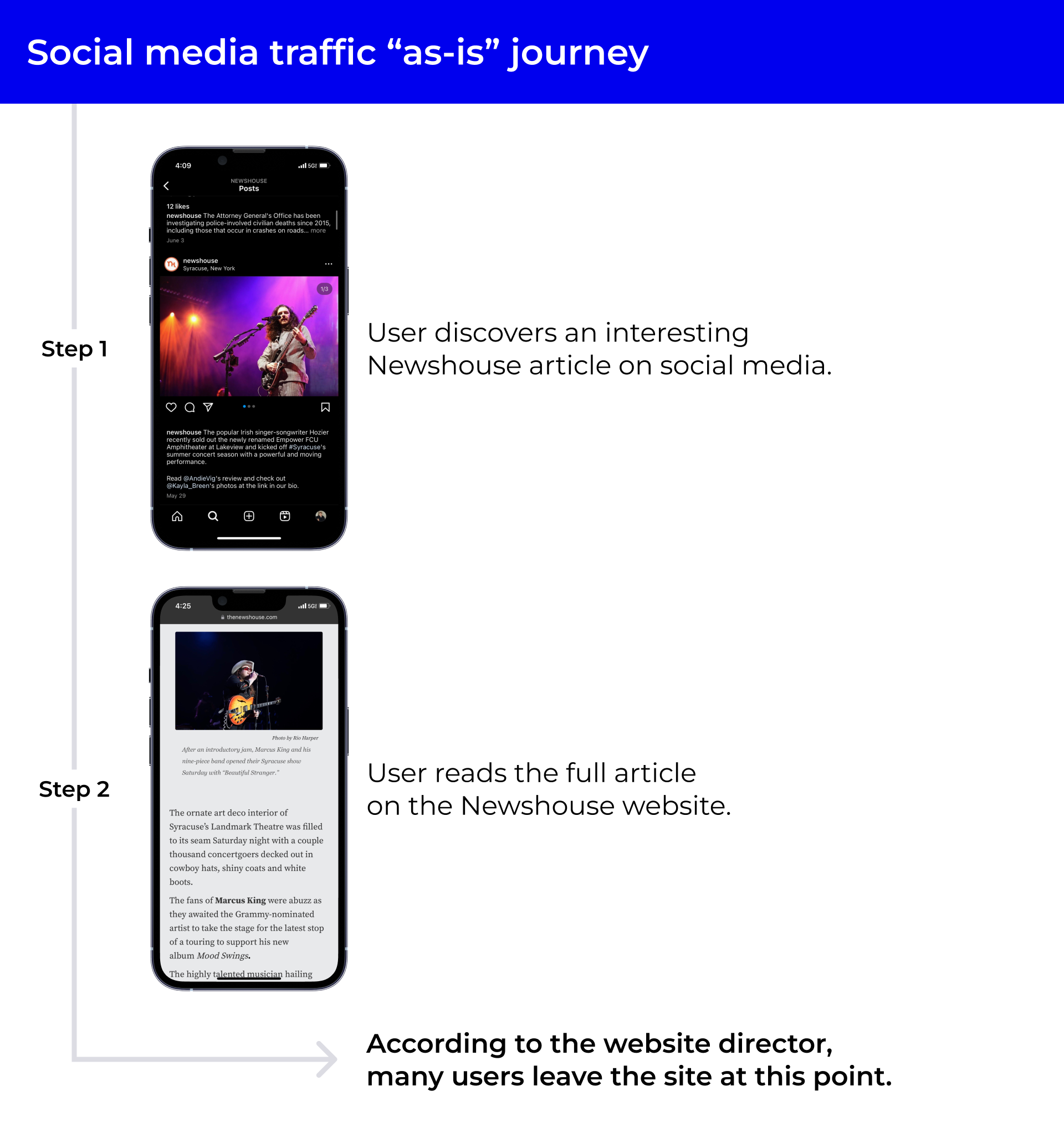
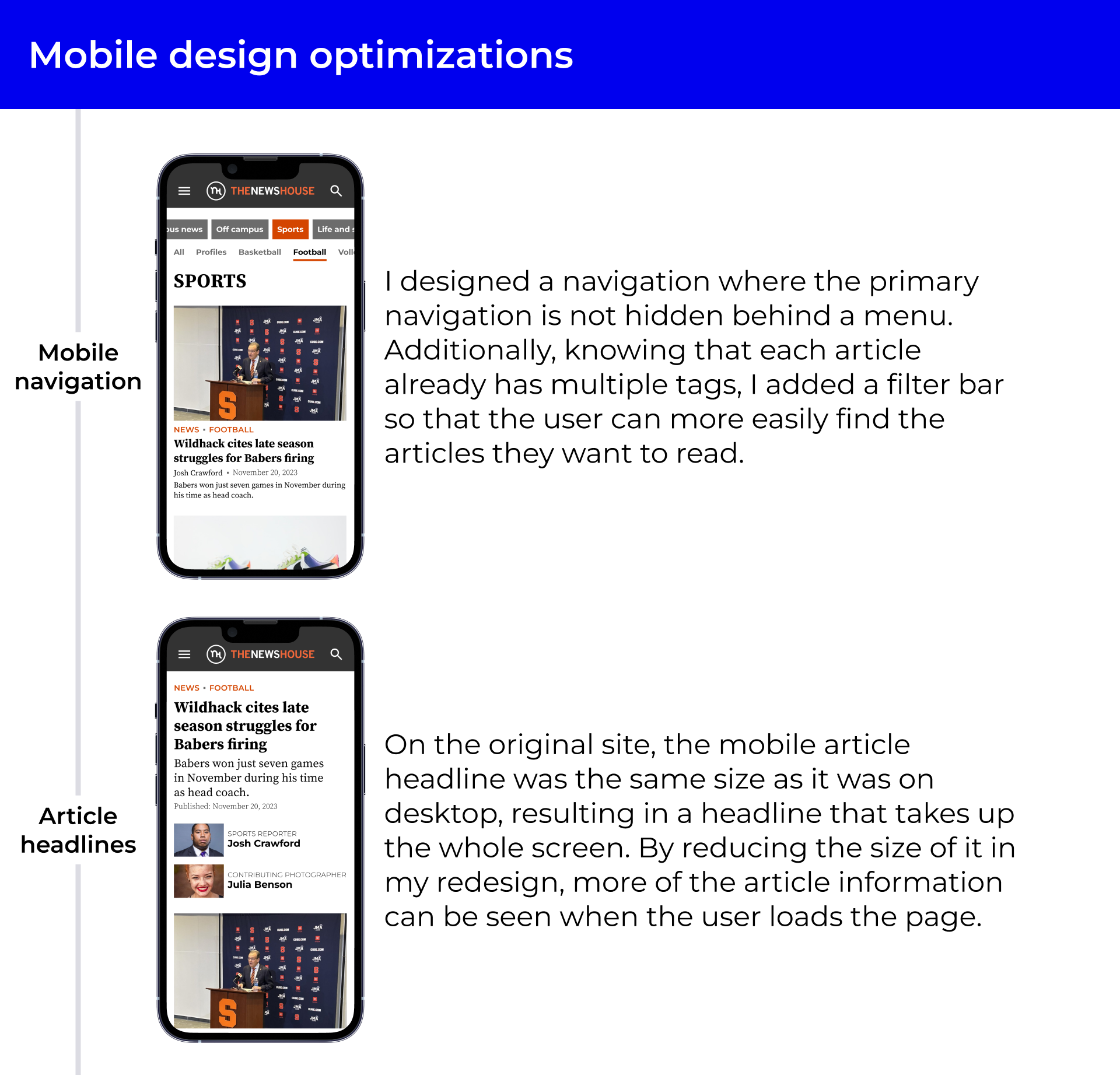
A primary user journey: mobile traffic from social media
The website manager said that users often come to the site when they find an interesting article on social media. After being directly linked to and reading that article, they leave the site.
Analyzing user behavior from analytics
The manager of the Newshouse said that users often come to a specific article on their phone through social media, read it, then leave without going to other articles or a section front.
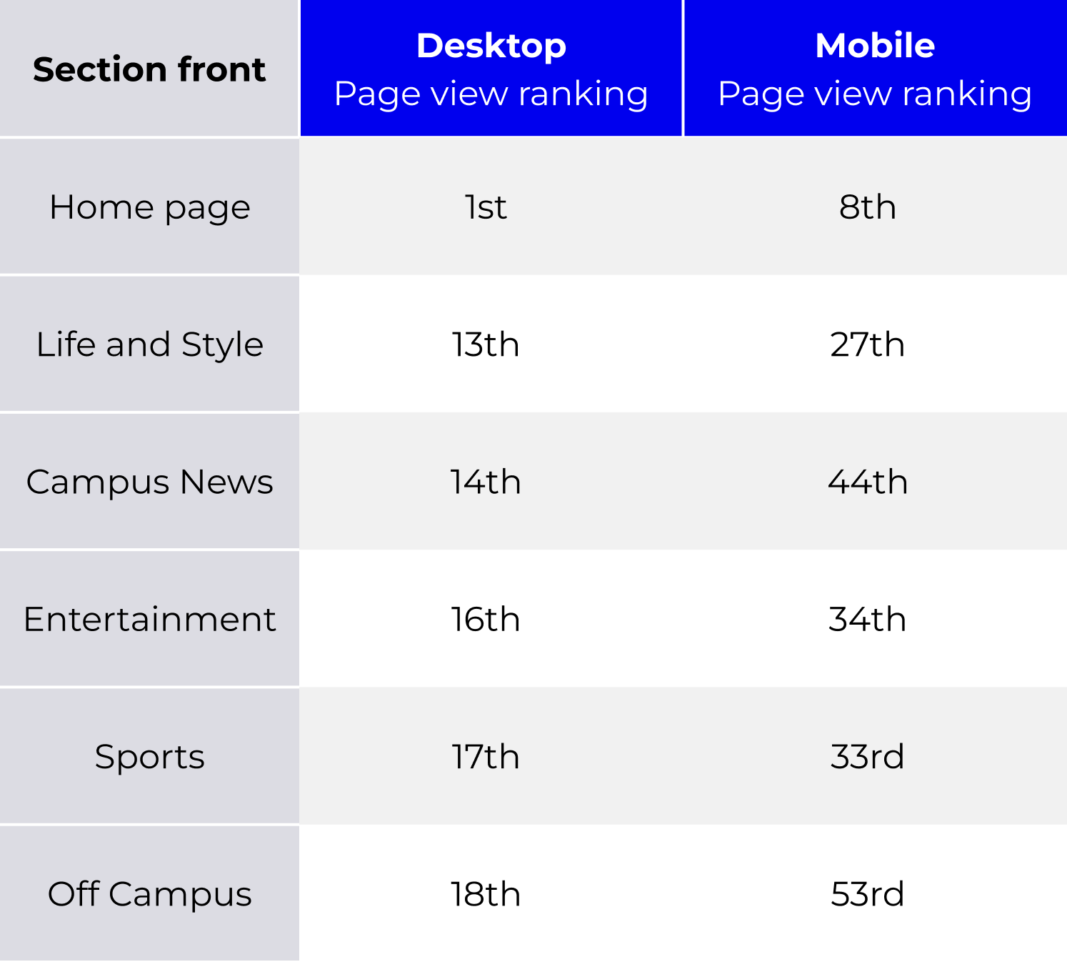
A pattern I noticed in the analytics data is that the section fronts on desktop have higher page view rankings than their counterparts on mobile.
One of the differences between the desktop and mobile views of the Newshouse is that on mobile, the section front pages are hidden behind a hamburger menu. That made me wonder if the mobile section fronts have lower page view rankings because they are not right in front of the viewer like they are on desktop.
Designing and iterating
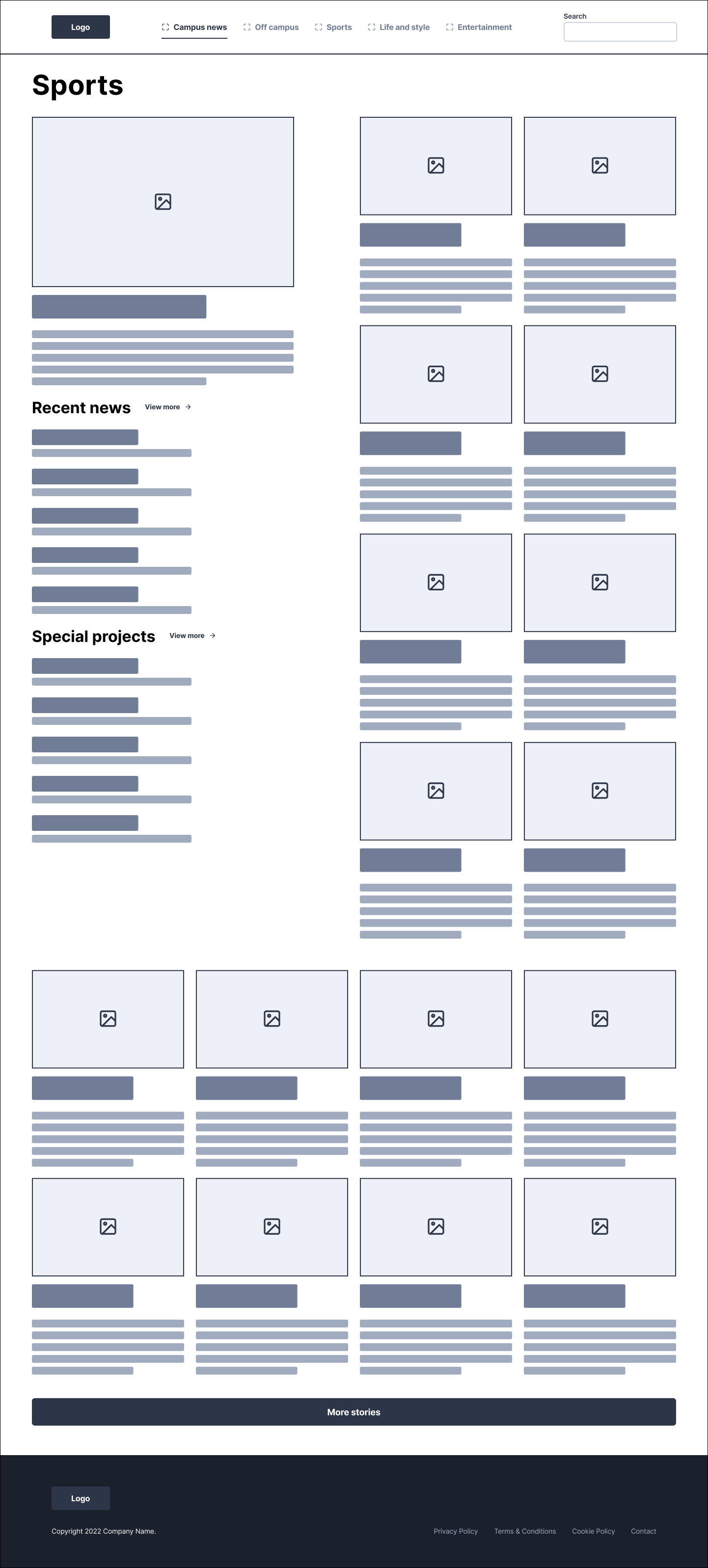
My wireframe had too many articles
After showing my wireframe to the website manager, he said there were too many articles, especially with the inclusion of a button that loads more articles.
Since the Newshouse only publishes a few articles per week at most, he didn't want there to be lots of older articles on the section fronts.
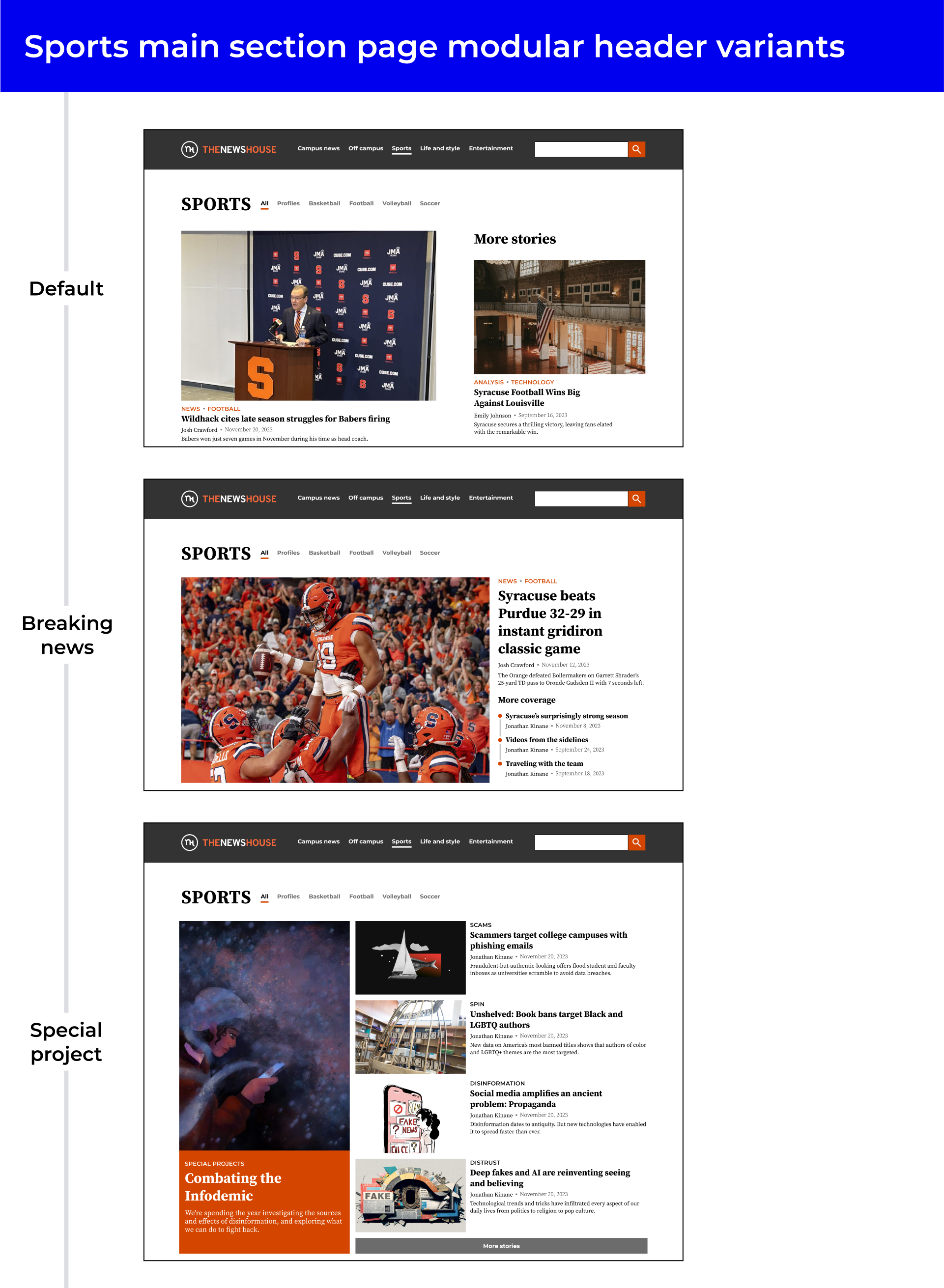
Designing different headers for different contexts
The website manager wanted to implement WordPress blocks on the website so that student journalists could change the layout based on their editorial decisions. I designed various templates for the section page header that student journalists can choose from, depending on the situation.
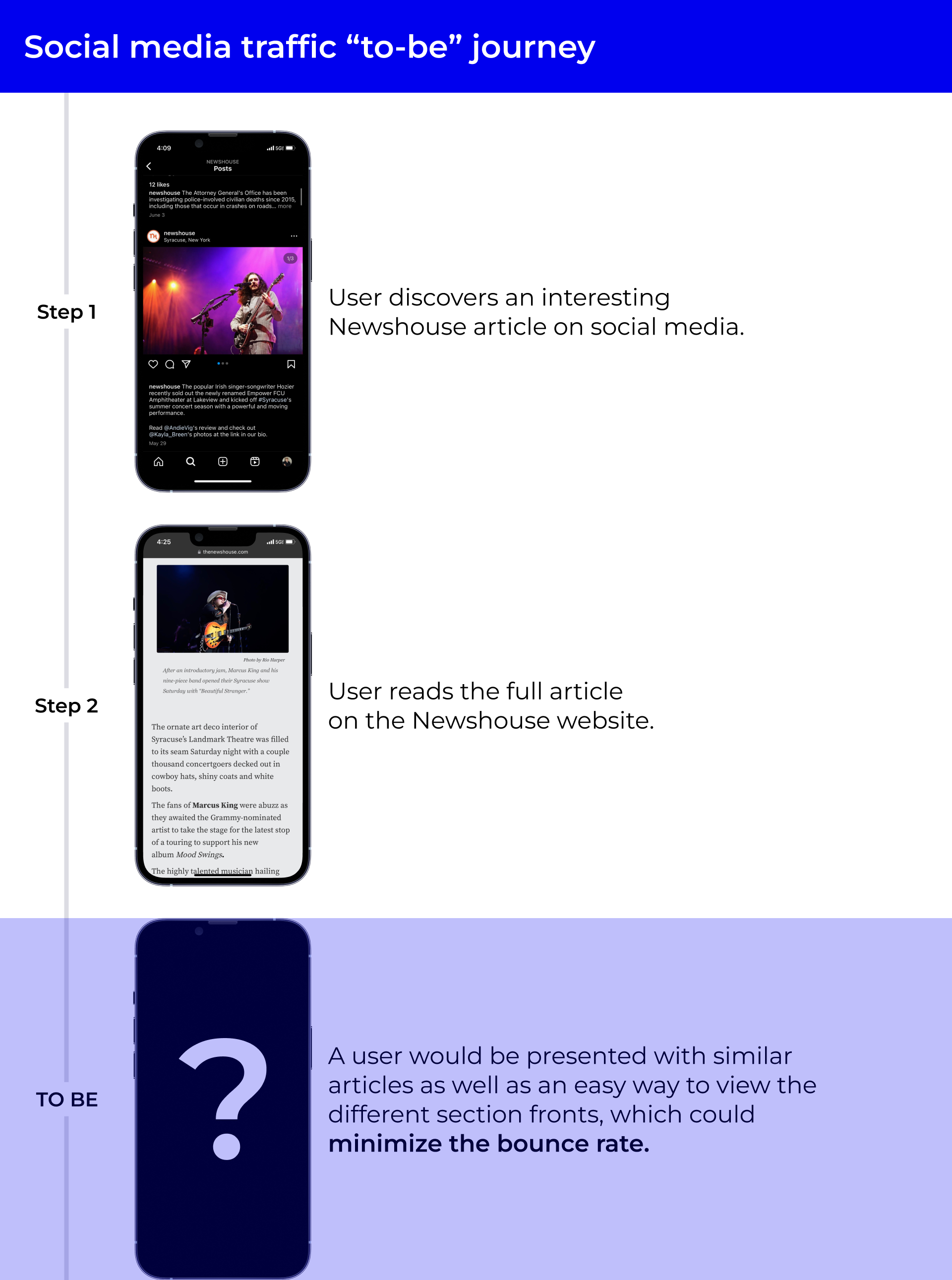
Mobile design optimizations
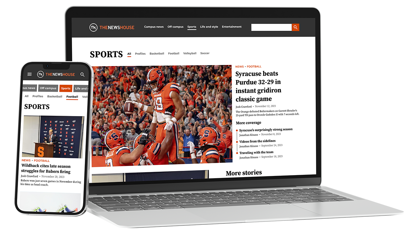
Based on the user journey of mobile users coming from social media, reading an article, and then leaving, I redesigned the navigation of the mobile site to not be hidden behind a hamburger menu. This means that users would be more likely to go to a main section page, where they can discover more articles.
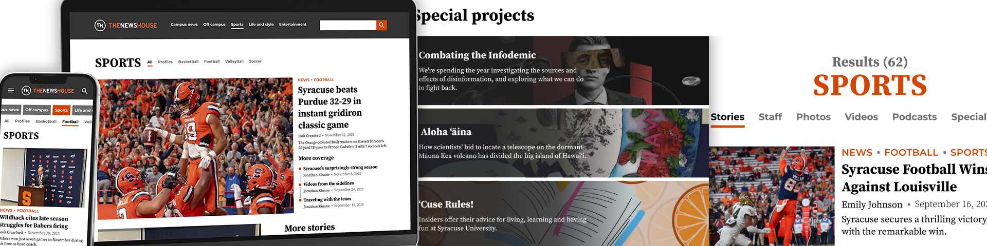
Final designs
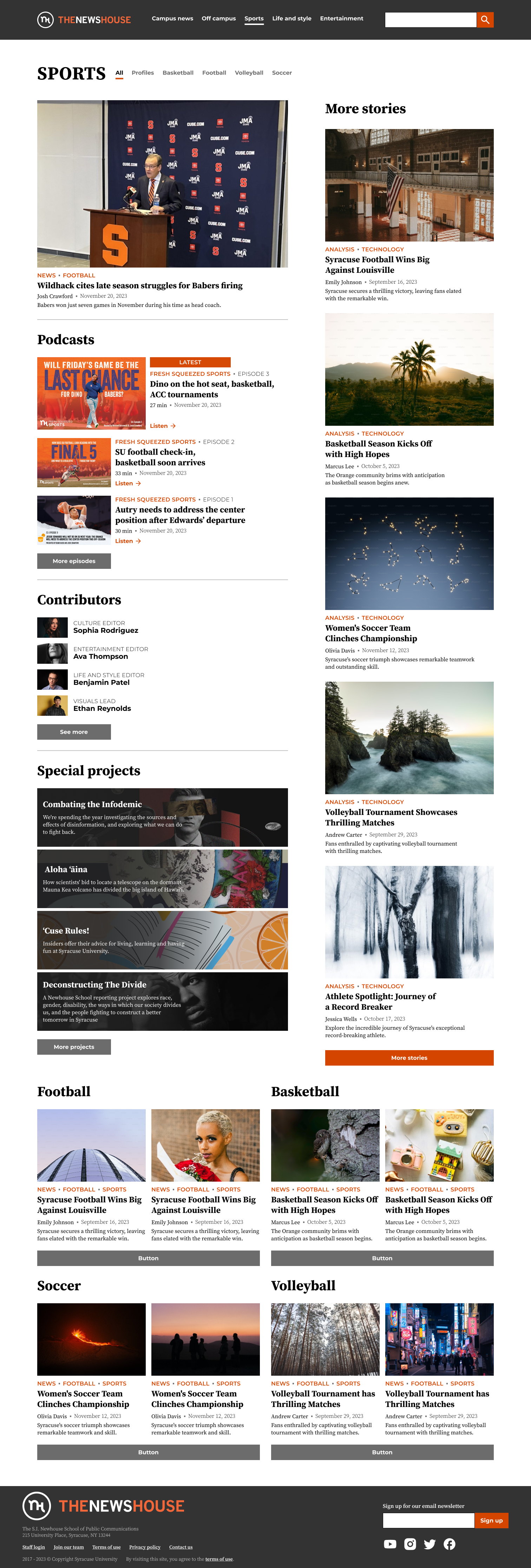
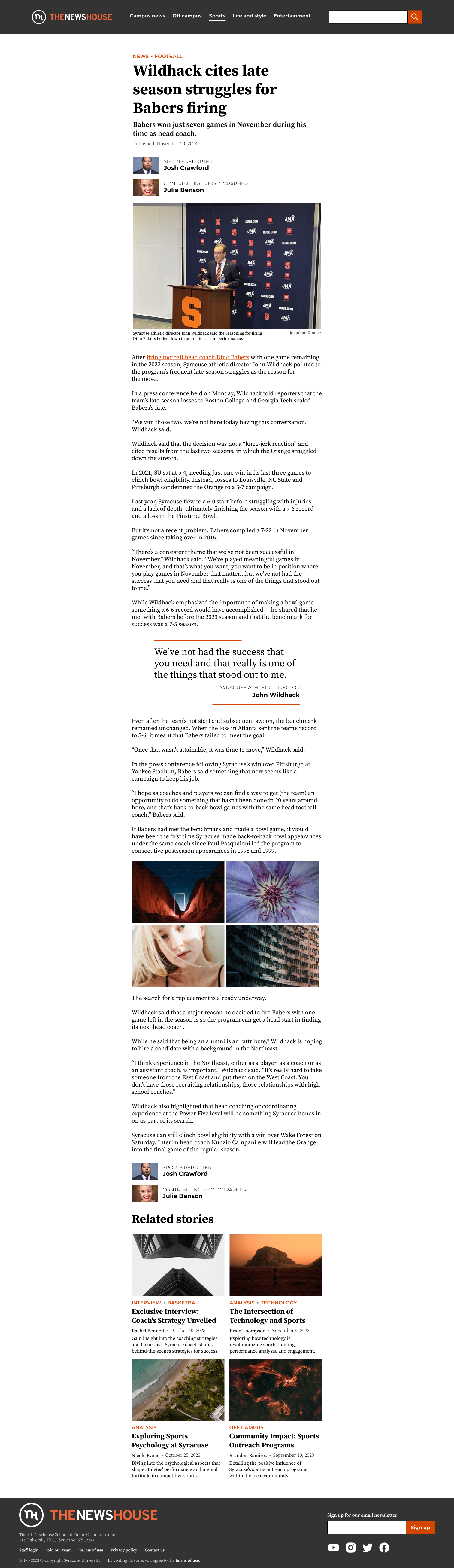
Sports section front
Article
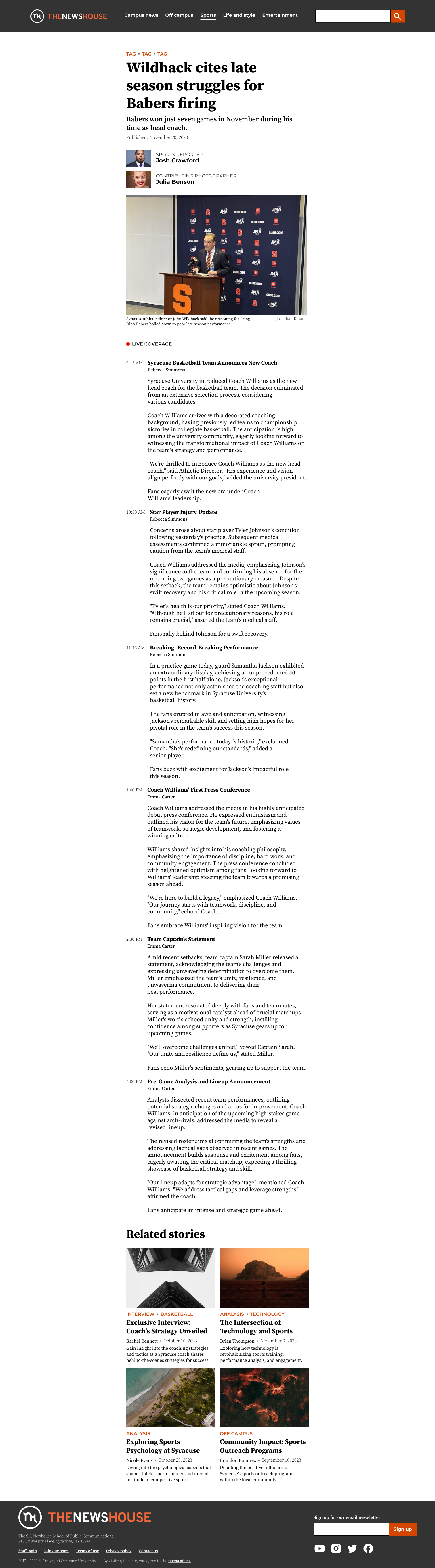
Live story
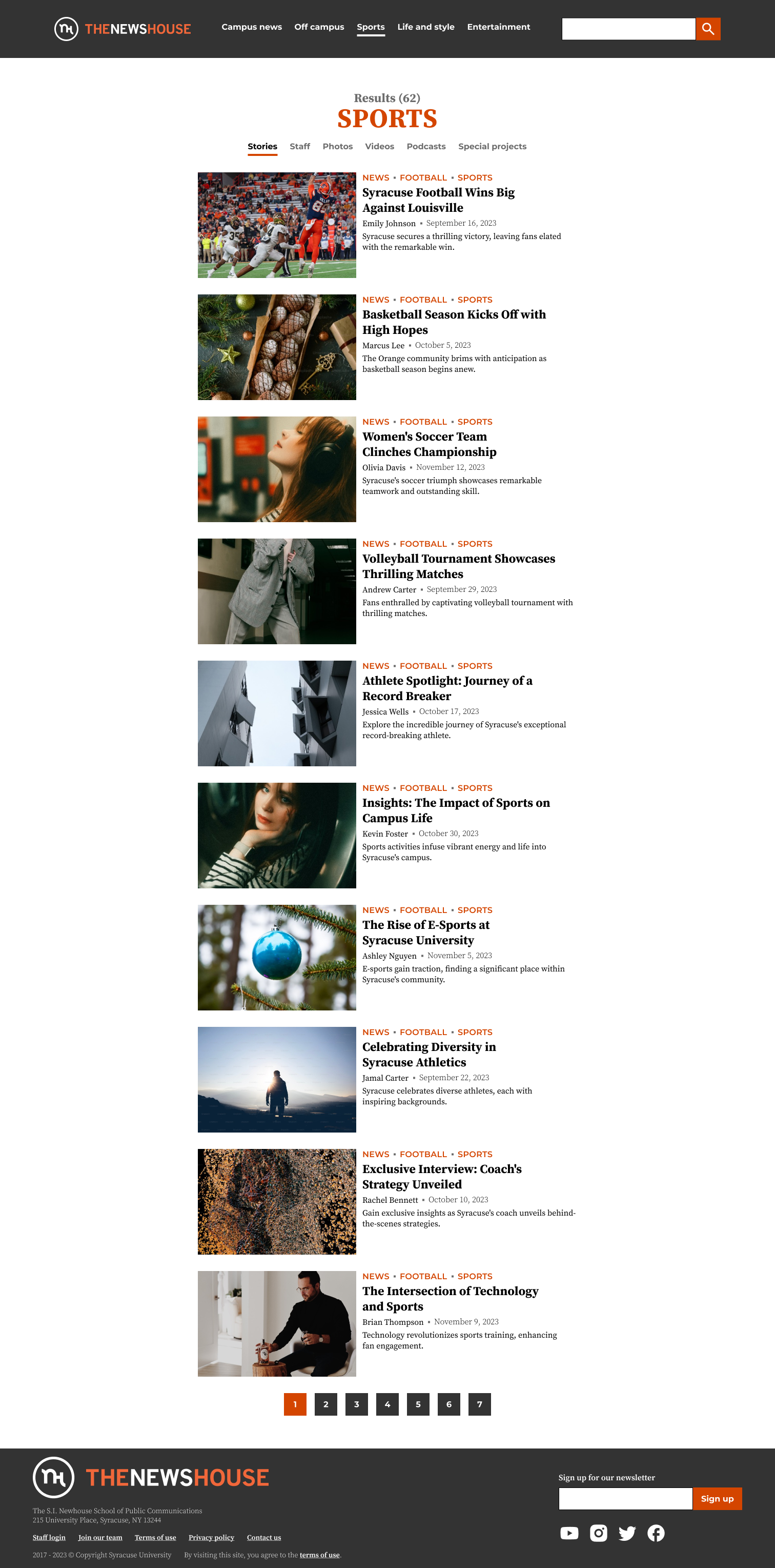
Search results
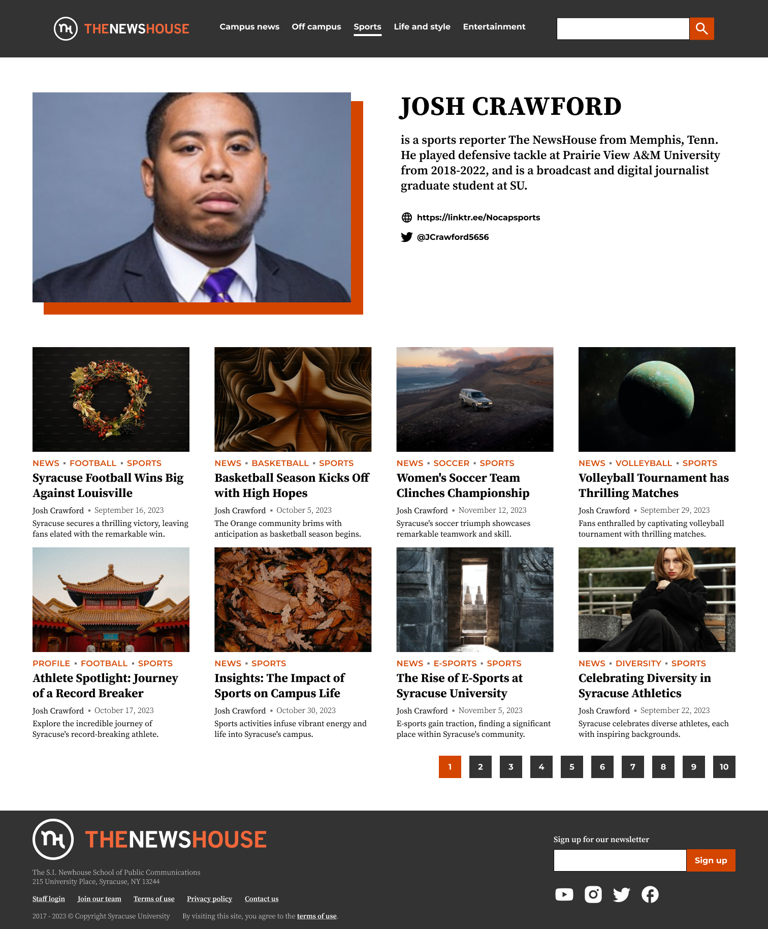
Contributor page
Lessons learned
Working with a client
This project showed me what it is like to work with a client and the importance of listening to different stakeholders, which in this case included the website manager, student journalists, and site users.
Combining qualitative and quantitative data
To understand the problems and constraints, I made use of Google Analytics data in addition to talking to users and student journalists. This combination of qualitative and quantitative data helped me create unique insights.