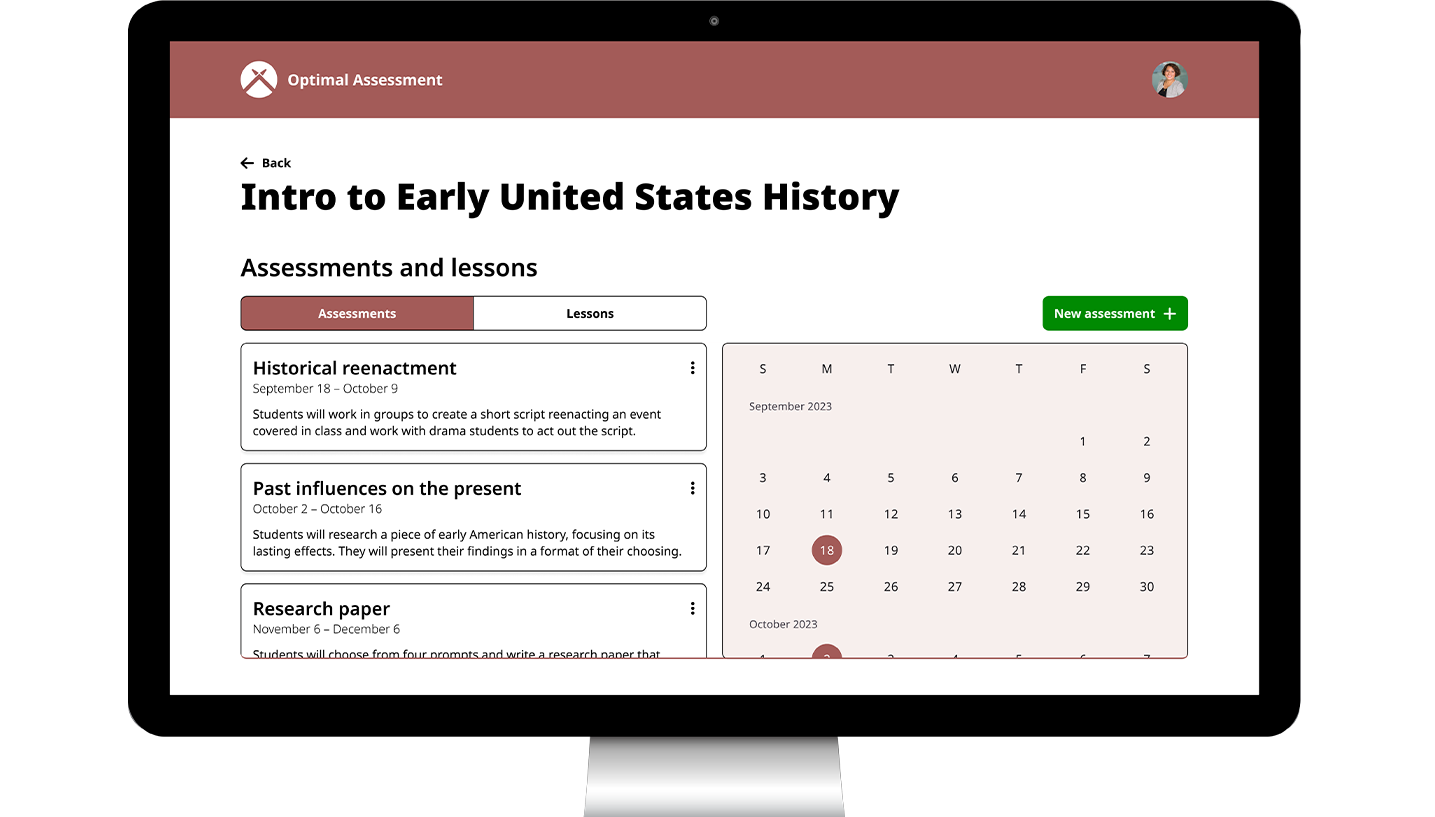
I worked with two other designers during a hackathon on an interface where students can list their preferred testing options (such as essays vs multiple choice) for the professor to see in a dashboard. Even though the other designers were not able to continue on with this project, I kept working on it after the hackathon.
Skip to final designsResearch
Understanding professors' problems
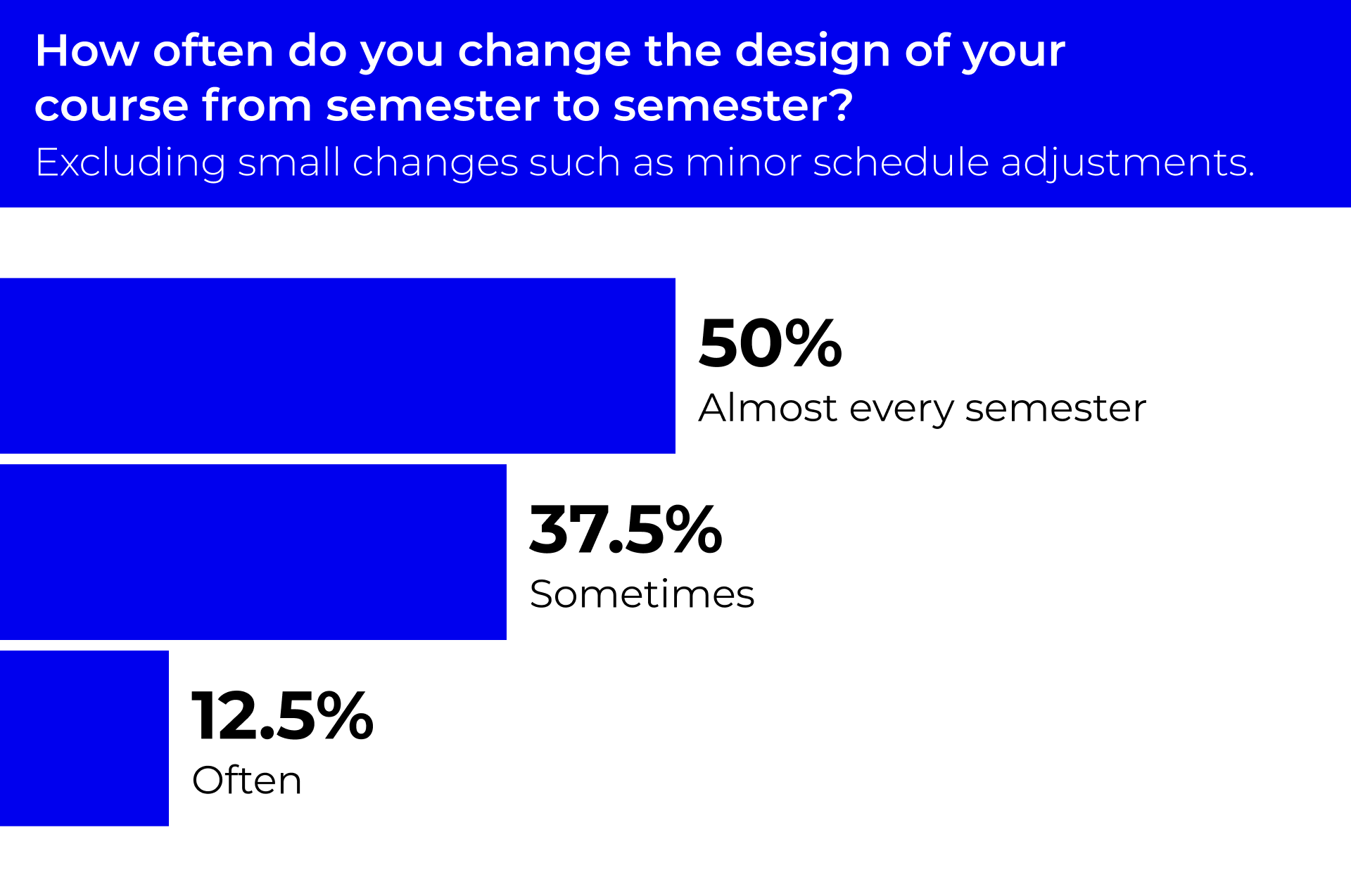
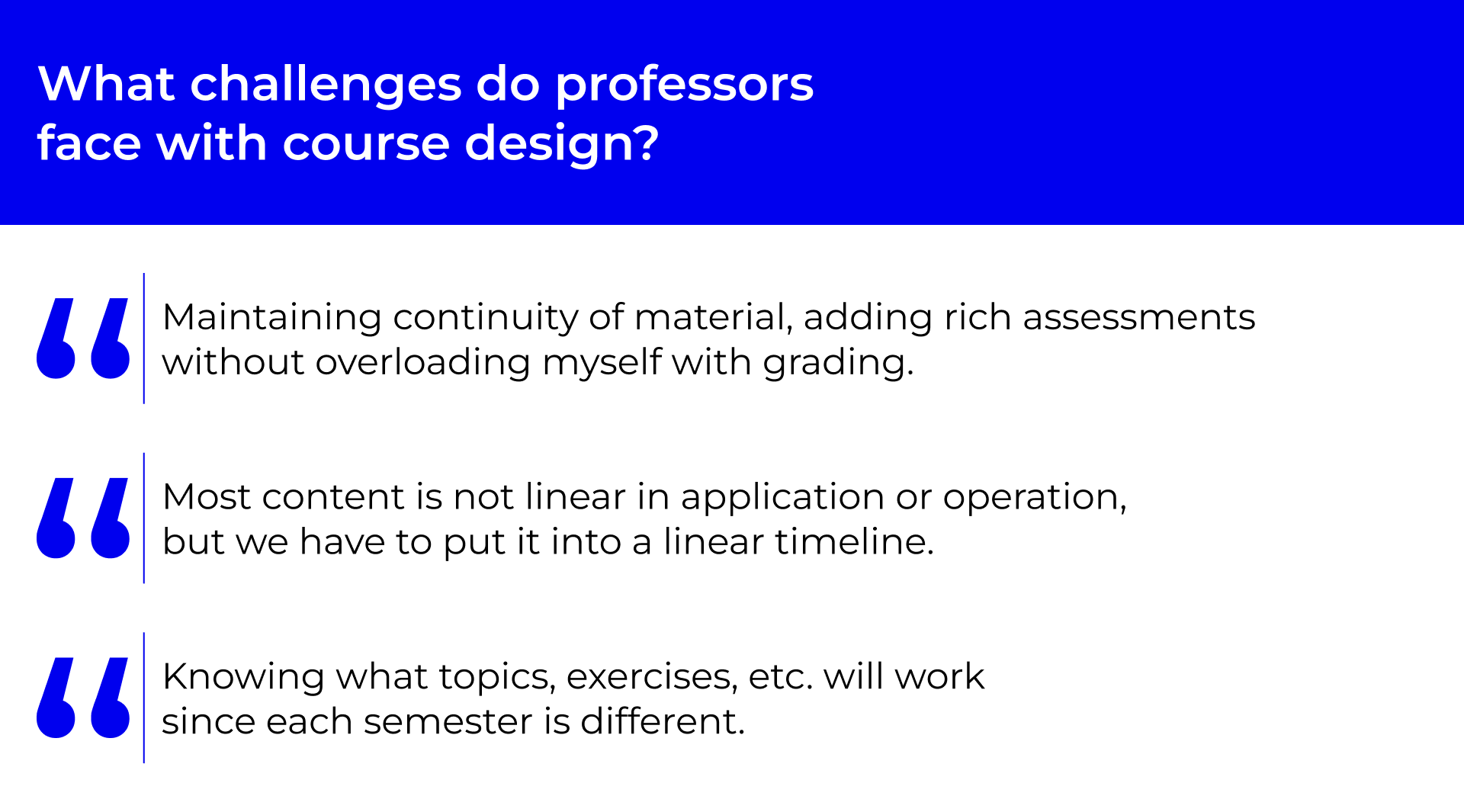
I surveyed eight professors, asking them about their course design process and the challenges that they face designing courses.
![A heading that says: How do professors design their courses. Below, there are 4 quotes. The first quote says: Sticky notes on my dining room table to sort and group various lessons/projects. The second quote says: I read blogs, journals, and articles daily and listen to podcasts. The third quote says: A Text Edit document to arrange all my notes and topics. The fourth quote says: A list of topics in [Microsoft] Word that I start with.](images/optimal-assessment/ProcessGraphics/HowDoGraphic.png)
Learning about learning
Universal Design for Learning
Universal Design for Learning is an educational framework that flips the course design process on its head. First you create learning goals, then you design engaging assessments, and you finish by designing lessons
Informing the information architecture
The Universal Design for Learning framework provided a foundation for the information architecture of the eventual design.
Putting it all together
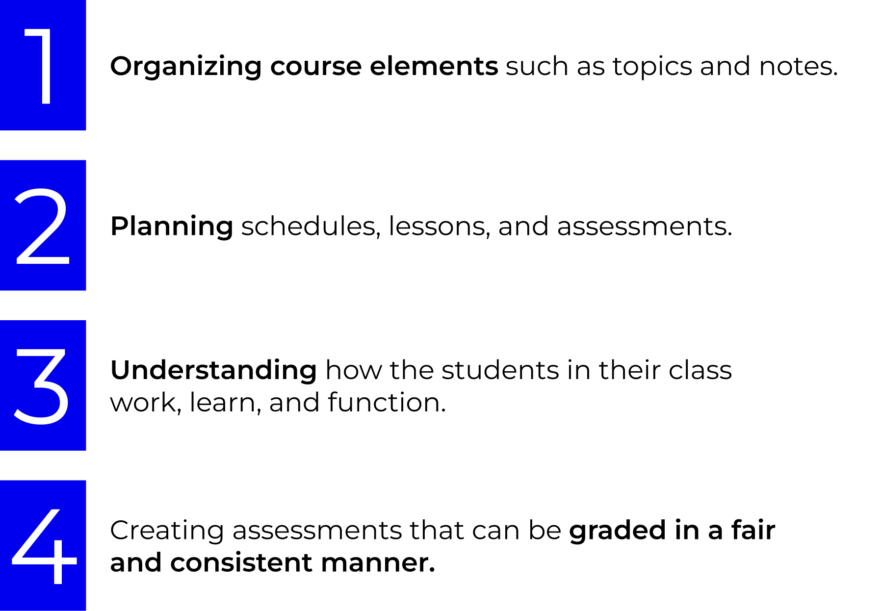
Before moving on, I reflected on what I had learned about professors' goals and priorities.
Mapping how professors design courses
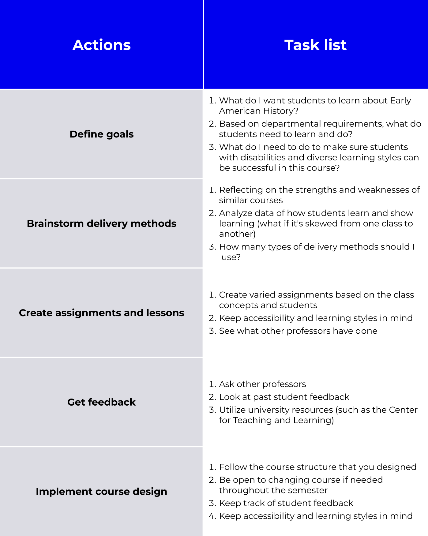
I put together what I knew about the professors who would be using this course design application and made a user journey about what they would need to do to design an ideal course.
Designing, iterating, and testing
Entering course elements
Version 1 design
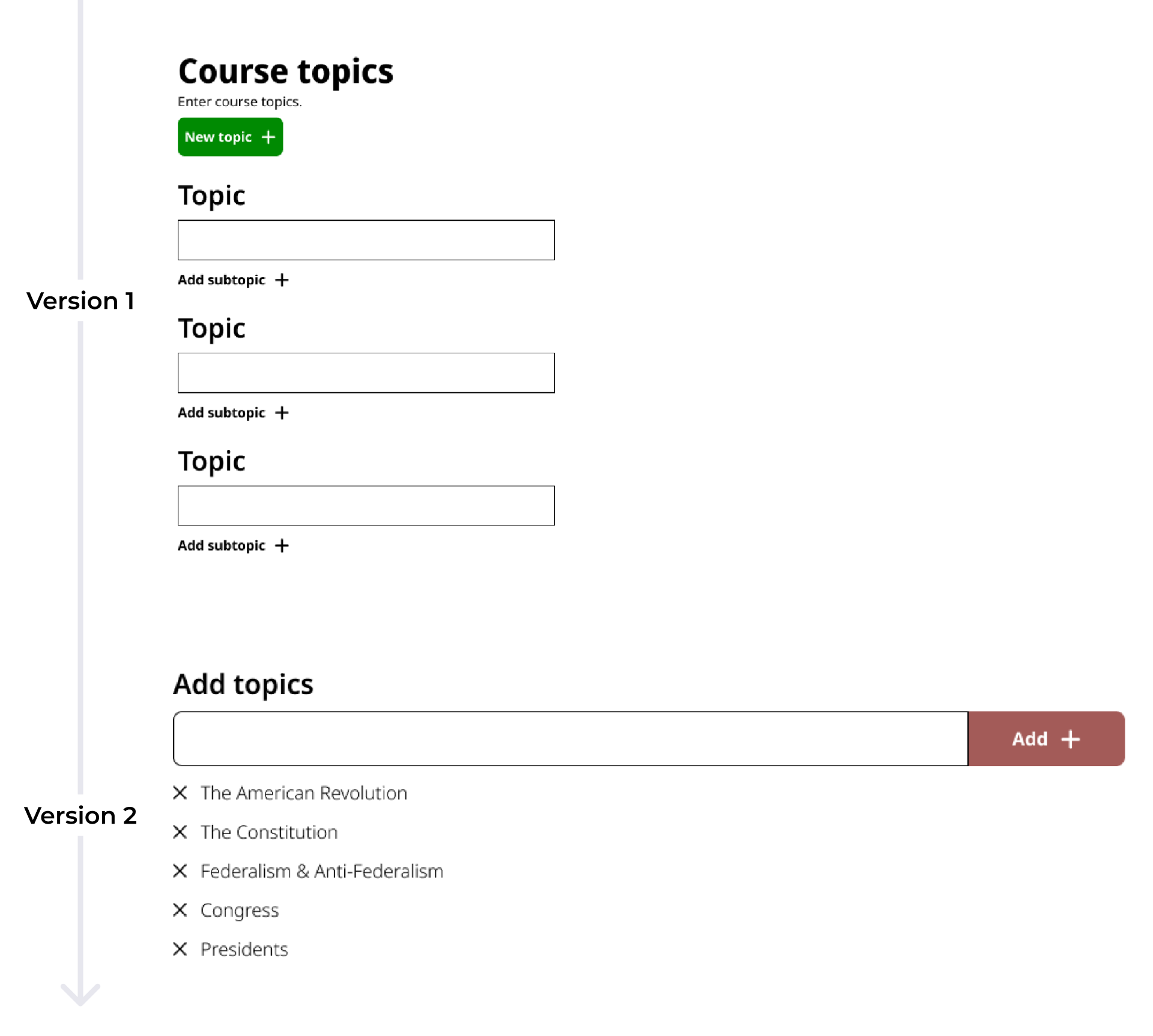
Because a course can have many different elements (such as a long list of topics), I needed to design a component that would allow professors to continuously add entries to a list through user input. My first iteration of this component duplicated the entire input field component each time the user added an entry.
Version 2 design (after user testing)
The professor found the first version of this component confusing and had a hard time figuring out how to interact with it. To fix this, I redesigned the it so that instead of the entire input field being duplicated, the entry would just be listed as a tag under the input field.
Forming connections between course elements
Version 1 design
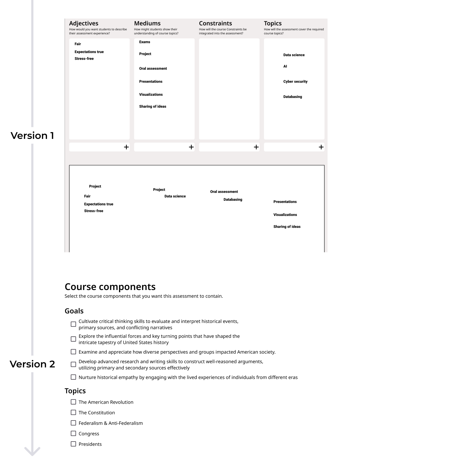
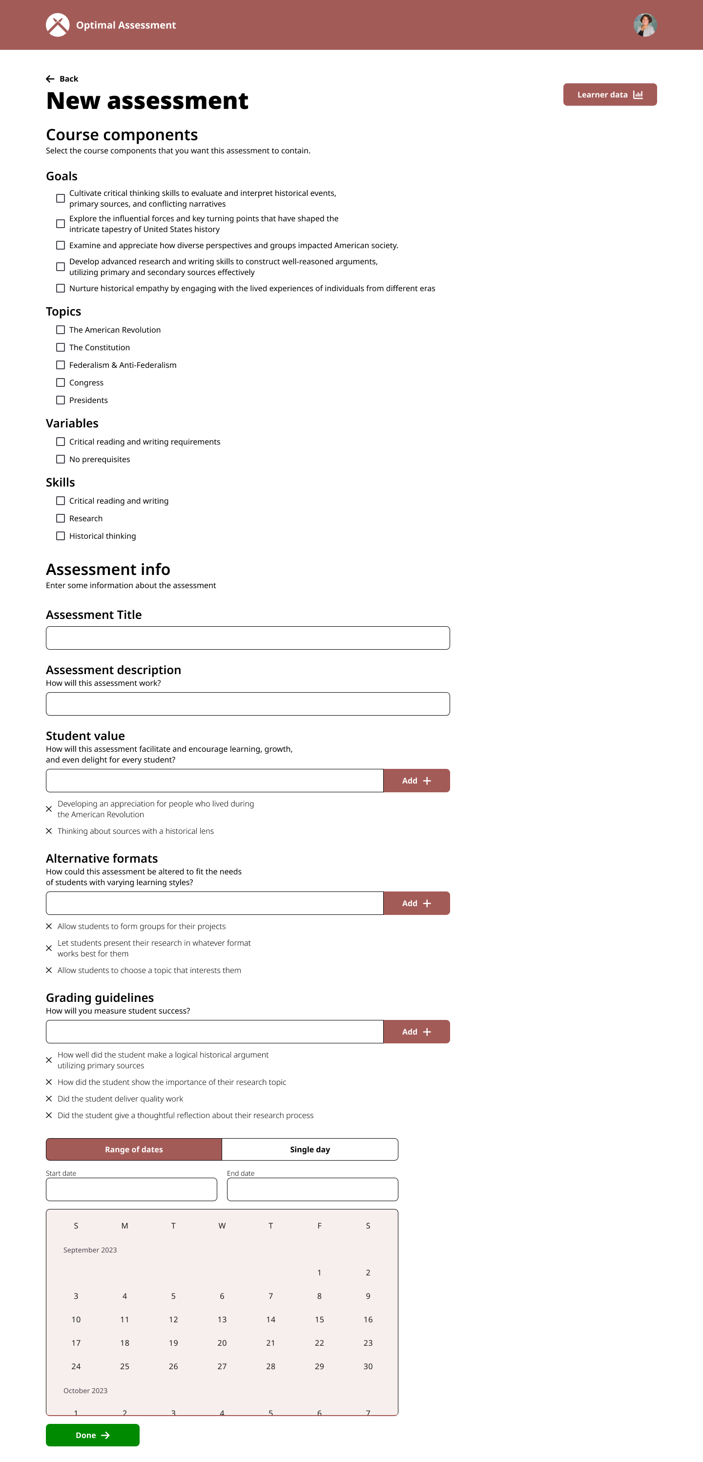
Because professors have so many components that they need to keep track of in each of their courses, I decided to design a screen where the professor could select the course components that apply to the assessment or lesson they are creating.
Version 2 design (after user testing)
The professor liked how she could view multiple aspects of her course in one place, however she wasn't a fan of the whiteboarding canvas. While this was just one comment from a single user, it got me thinking about the fact that not all professors would find a whiteboarding canvas intuitive. I changed this to a simple checklist where a professor can choose individual course aspects that they want to apply to a new assessment.
Final designs
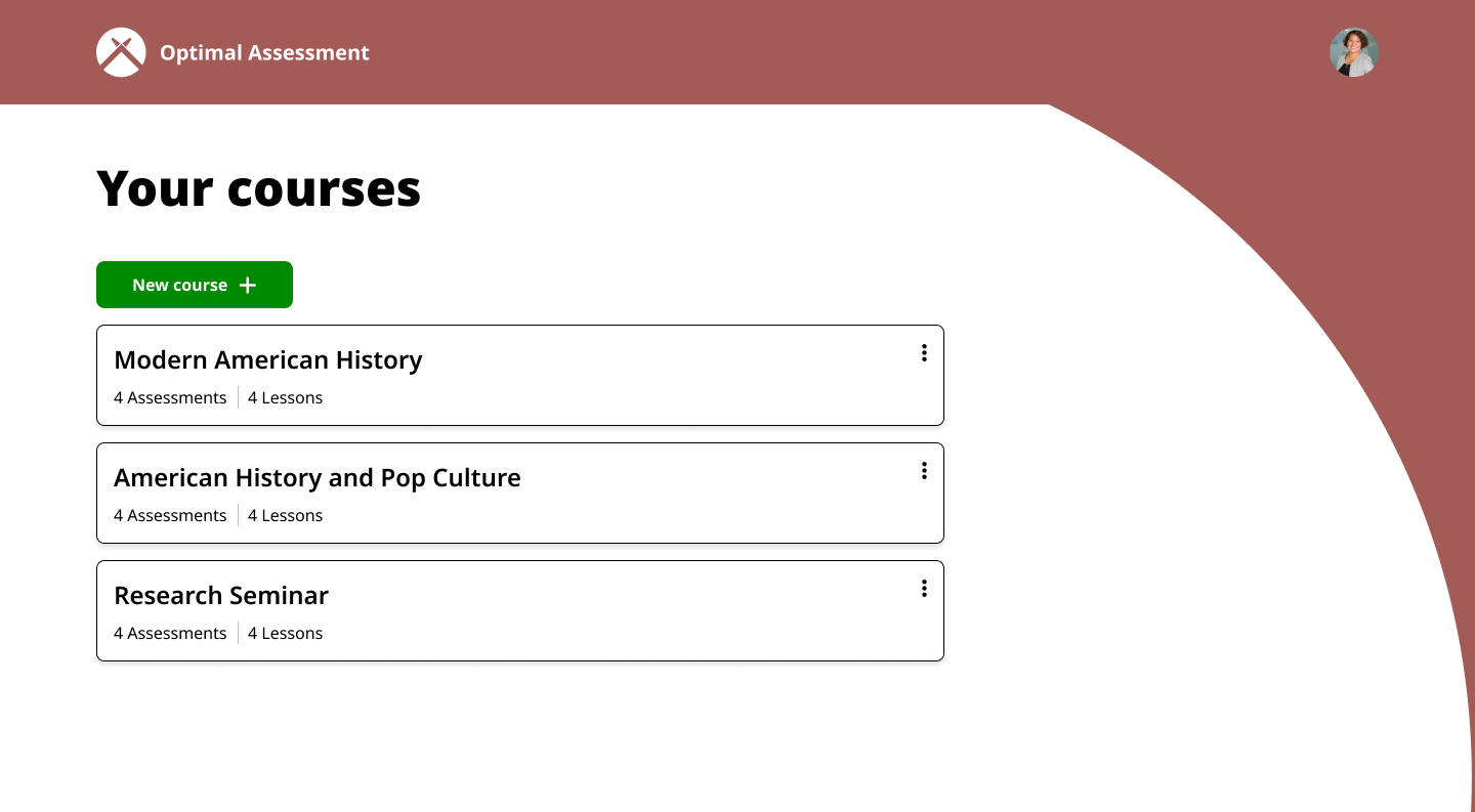
Courses screen
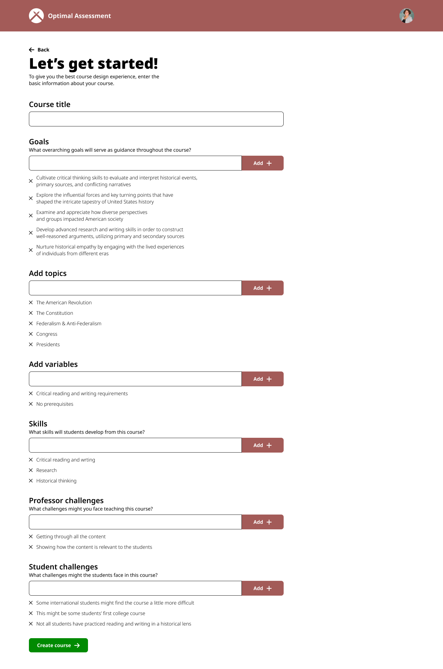
Course info screen
Course dashboard
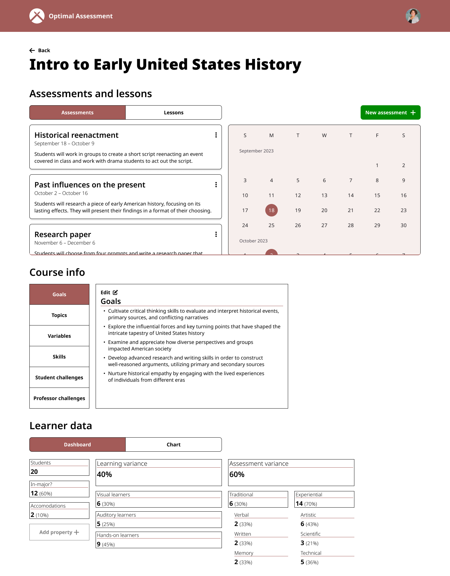
Assessment creation screen
Lessons learned
Creating a consistent design system
One thing I learned from creating my own design system for this project is that reusing elements across contexts helps with rapid iteration and creating a cohesive product.
Working as the only designer
My partner is not a designer, so I was in charge of the user research, UX design, visual design, and content design. As the only designer on this project, I had to stretch myself and my skills. This helped me grow as a designer, but also limited the project's potential since I didn't have another design perspective on the project. This is why I want to onboard another designer.

